Plus: EveryBody Counts 2024

Healthcare moved online. It left the people who need it most behind.

Plus is an AI healthcare service for adults over 75, a group facing frequent healthcare needs and lower digital confidence. It uses voice, reminders and plain-language health tracking so someone can manage their own care without asking their children for help every time.
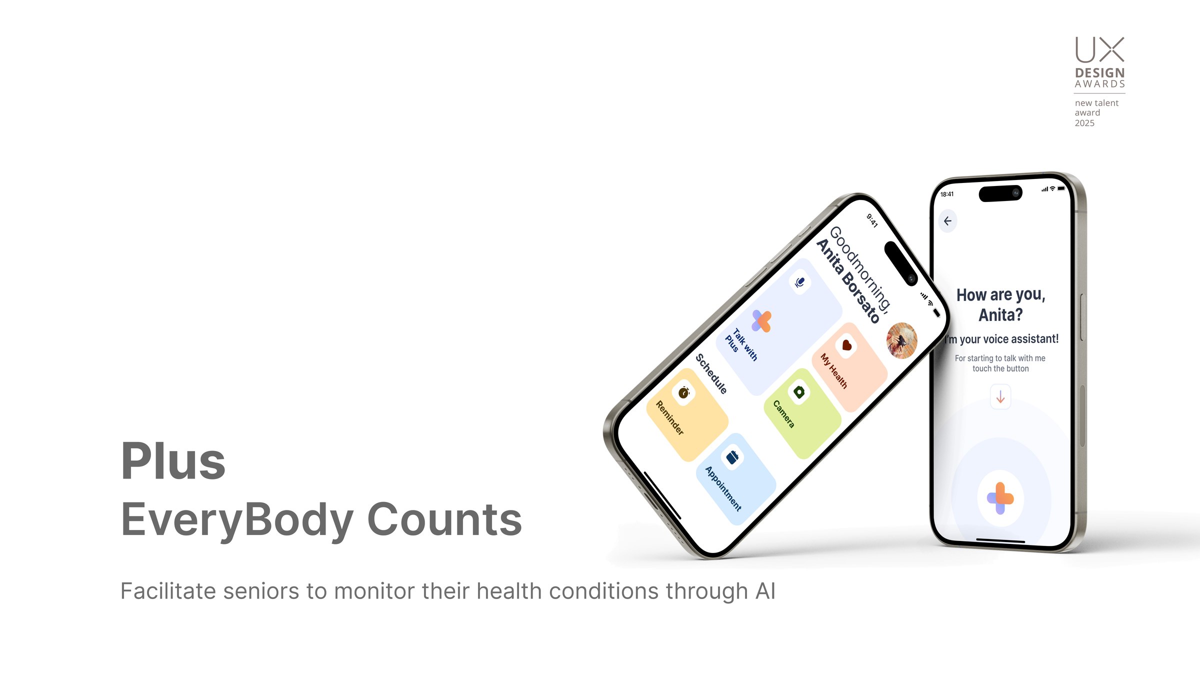
Plus: EveryBody Counts, the app shown on two phones, with the tagline facilitate seniors to monitor their health conditions through AI

My role

User research, service design, AI system design, task analysis & usability testing, prototyping.

Timeline

Feb 2024 – Jun 2024
4 months

Context

Envisioning AI Through Design
Politecnico di Milano, A.Y. 2023/24

Tools

Figma, ProtoPie, LLM
After Effects

Recognition

UX Design Talent Award, 2025
DNA Paris Design Award, 2025
Core77 Design Award, 2025
Asian Design Award, nominated, 2025

Team

Mindan Chen
Cansel Gursoy
Fabio Sannino
Yaren Yavuz
Giulia Jiangxian Zhu

As healthcare services move onto digital platforms, older adults face accessibility barriers, a lack of support and social isolation, at exactly the point in life when they need the service most.

This project asked what AI could do about that, and answered it as a service rather than a feature: understand how people over 75 actually live with their health, then build something that fits into that rather than demanding they adapt to it.
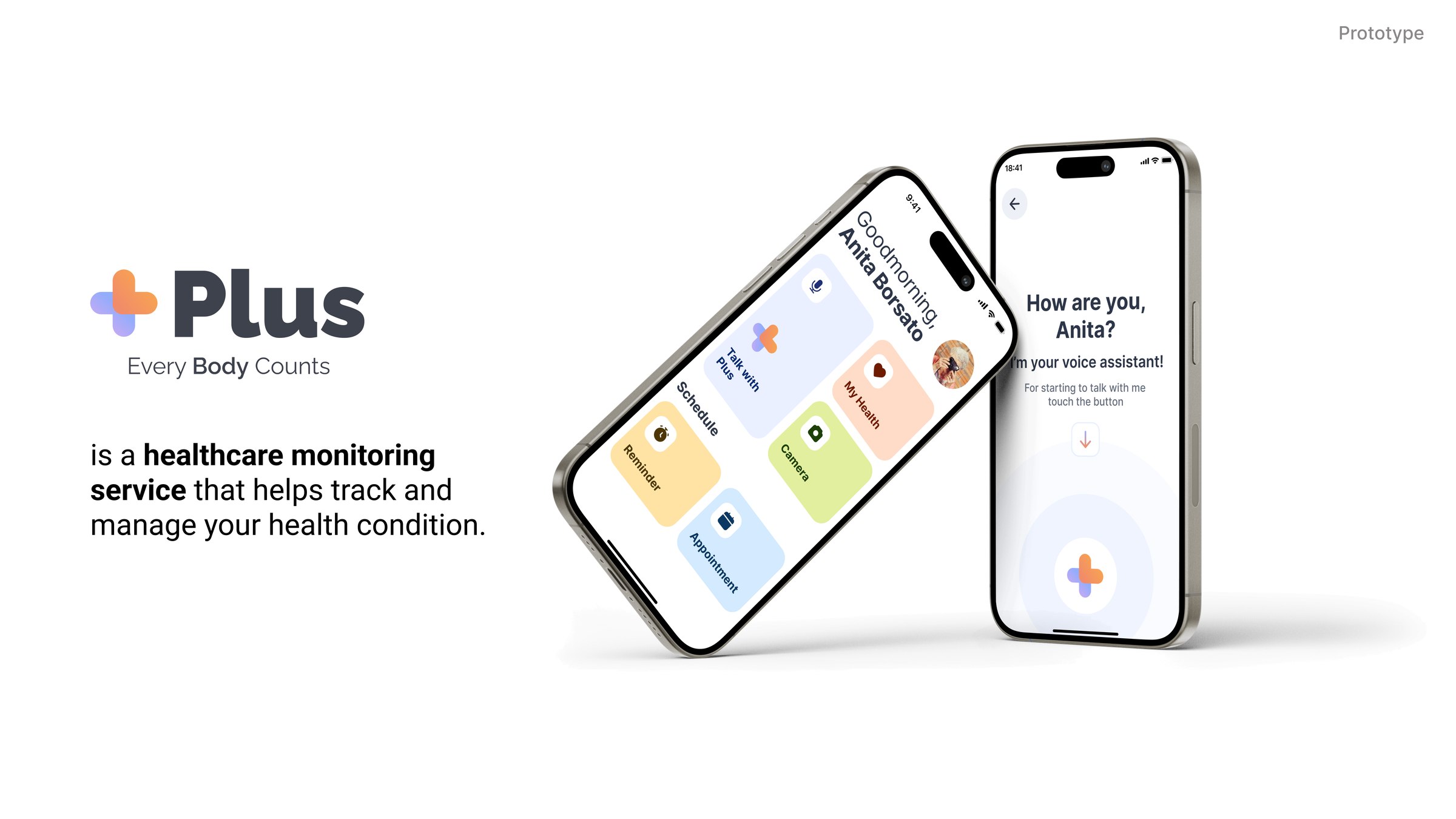
Plus, a healthcare monitoring service that helps track and manage your health condition, shown on two phones: the home screen with voice, health, camera and schedule tiles, and the voice assistant asking how are you

Process

One question, carried through four phases.

The project ran as a double diamond over fourteen weeks, from context analysis through to a tested prototype. The research question was set at the start and everything downstream was checked against it.

How can we use AI to create support systems that promote community integration and meaningful relationships?
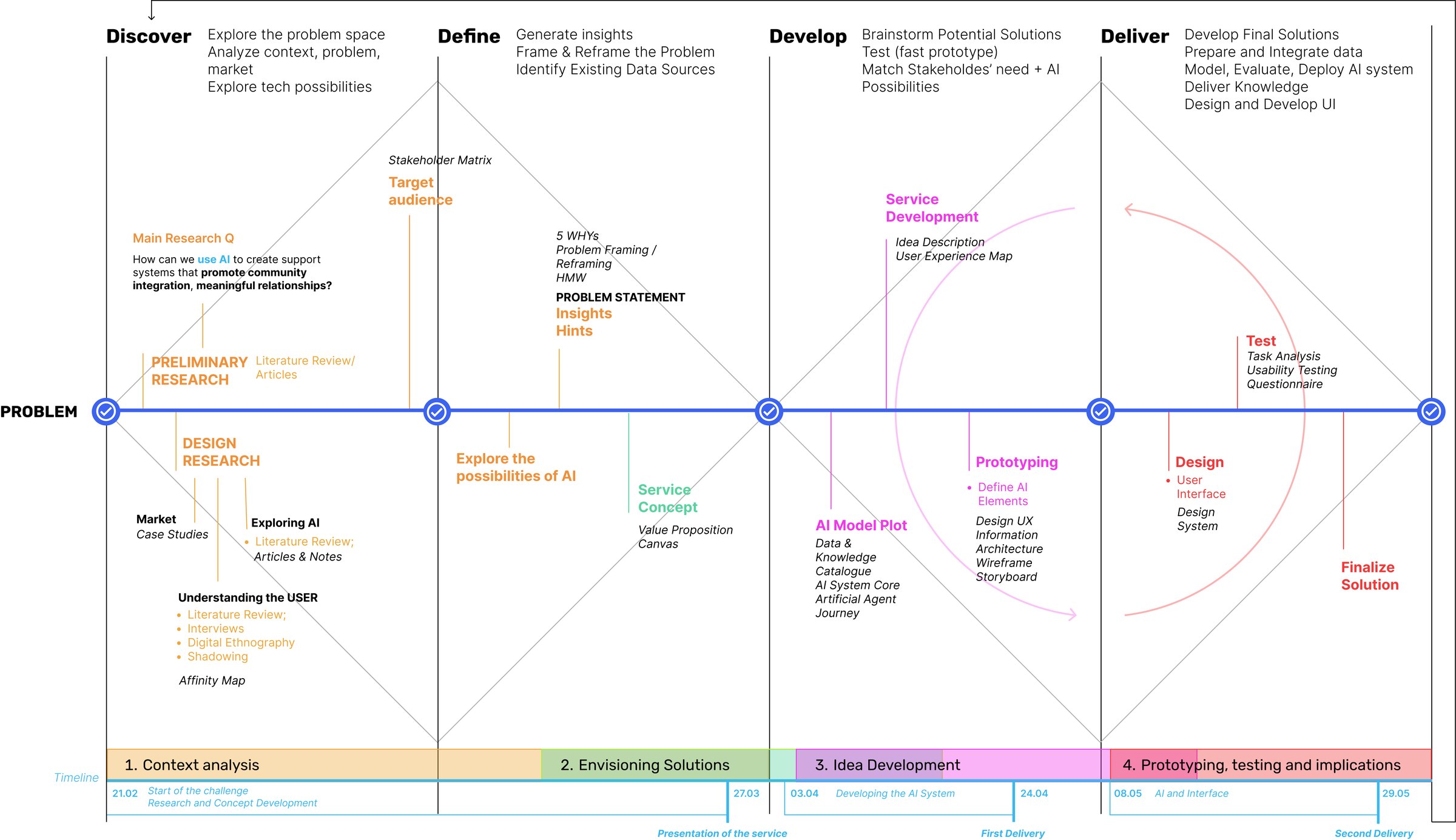
Double diamond process map across discover, define, develop and deliver. Discover covers preliminary research, market case studies, literature review, interviews, digital ethnography, shadowing and an affinity map. Define covers the stakeholder matrix, target audience, five whys, problem reframing, how-might-we statements and the problem statement. Develop covers the AI model plot, data and knowledge catalogue, service development, prototyping, information architecture, wireframes and storyboard. Deliver covers user interface design, the design system, task analysis, usability testing and a questionnaire. A timeline underneath runs from 21 February to 29 May across four stages: context analysis, envisioning solutions, idea development, and prototyping with testing.
Four phases, with the two deliveries marked. The methods below the line are the ones that produced evidence: shadowing and interviews in discover, the problem statement in define, the AI model plot in develop, and task analysis with usability testing in deliver.

01 / Background

The population this fails is about to double.

761 million people were 65 or over in 2021. By 2050 that becomes 1.6 billion, moving from one in ten of us to one in six.
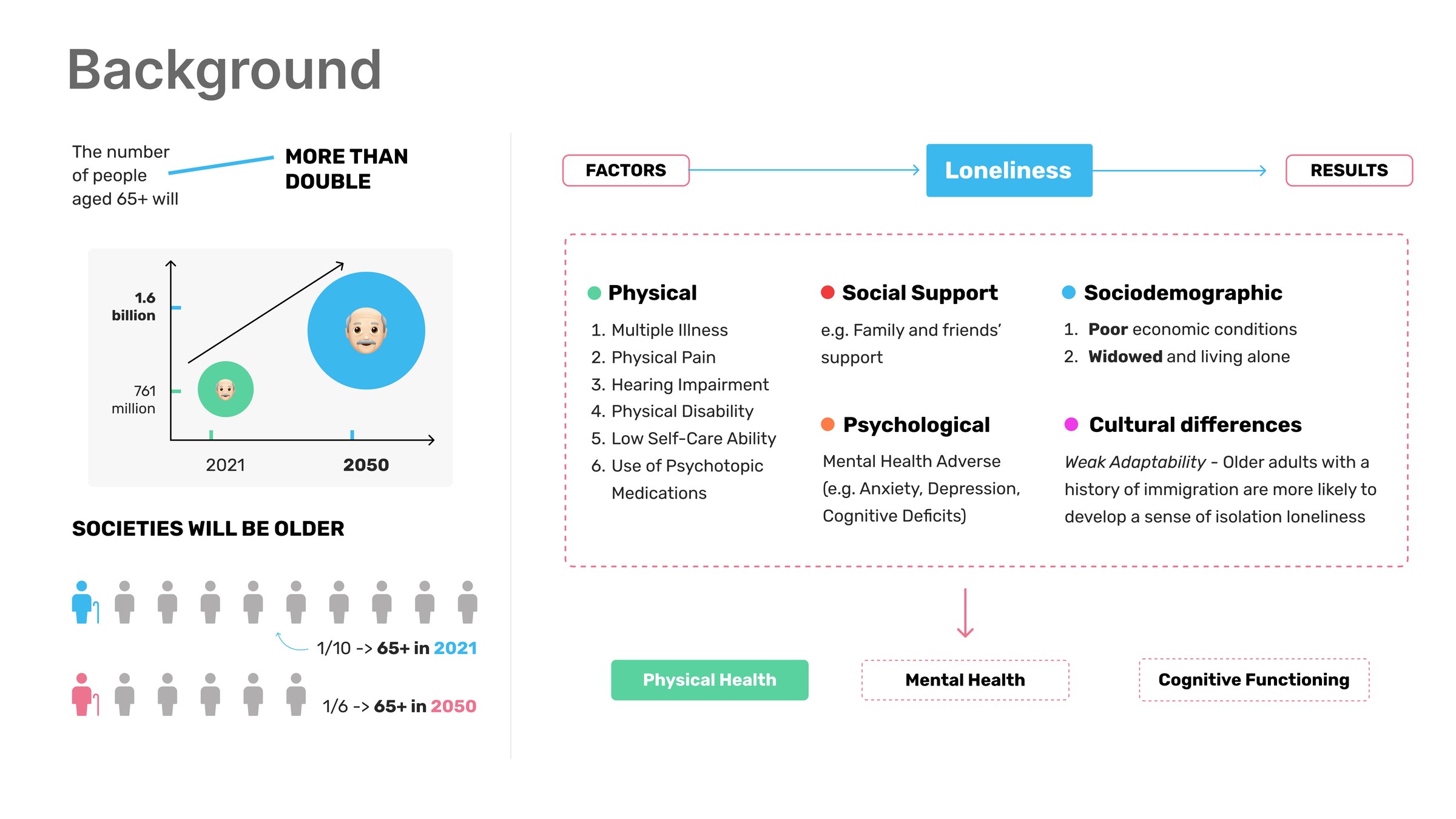
Background board: ageing population projections, and the factors that lead to loneliness and its health consequences
Physical, psychological, sociodemographic, social-support and cultural factors feed the same outcome, loneliness, which then shows up as physical health, mental health and cognitive decline.

Mapping the factors mattered more than the headline number. Multiple illness, hearing impairment, low self-care ability, widowhood, poor economic conditions, a history of immigration all converge on loneliness, and loneliness is not a soft outcome. It returns as measurable physical decline, mental health harm and reduced cognitive functioning. A healthcare service that only handles appointments is answering a fraction of the problem.

02 / Research

Shadowing, interviews, and what people said about technology.

Shadowing and semi-structured interviews, coded into user understanding and user stories across daily activities, health and well-being, social relationships, and technology.
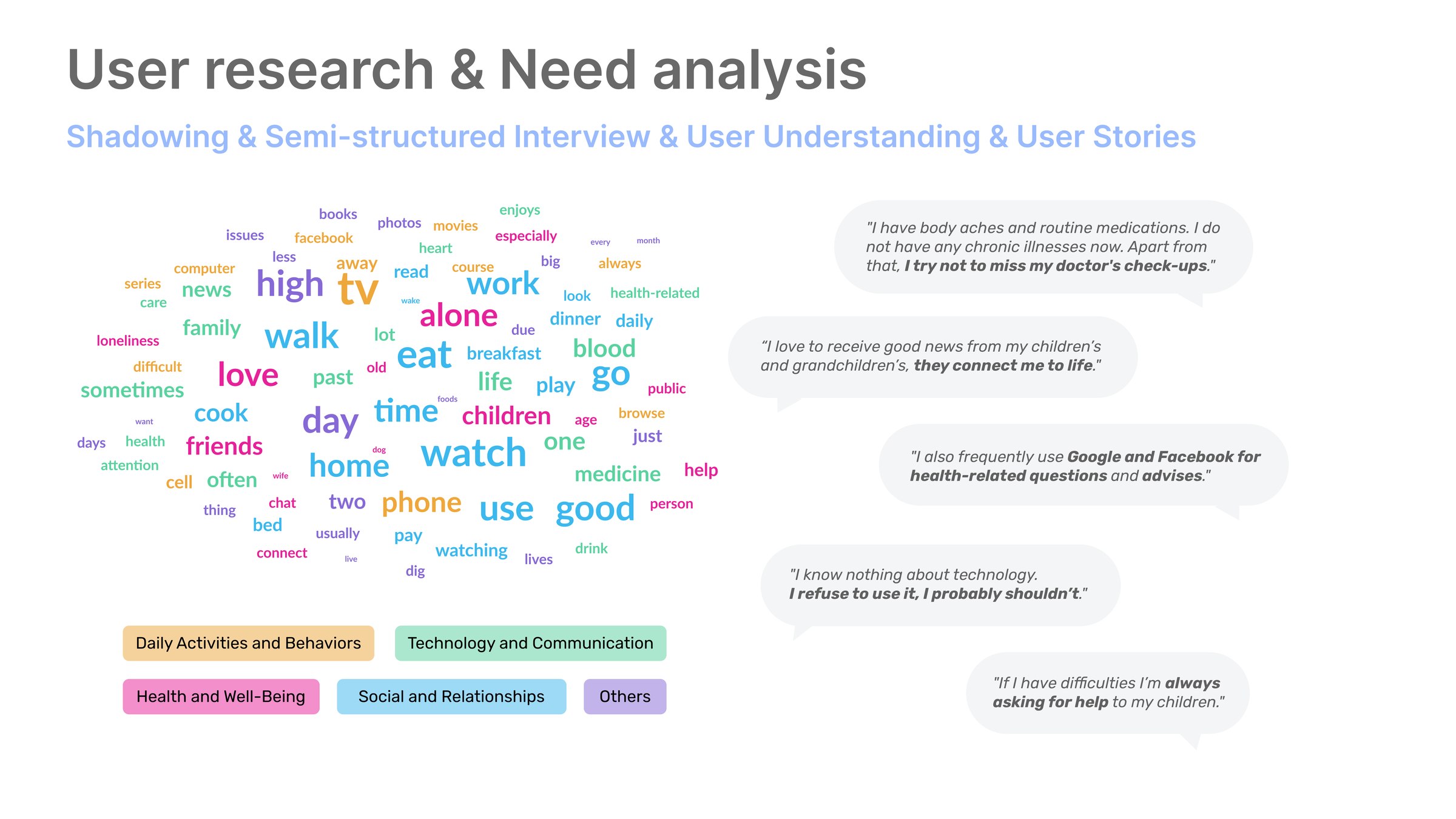
User research board: a word cloud from interview transcripts alongside participant quotes, grouped by theme
The word cloud comes from the transcripts; the quotes are the moments that changed the brief.
01

Refusal, not inability

“I know nothing about technology. I refuse to use it, I probably shouldn’t.” The barrier is identity as much as skill. It is a decision already made about what kind of person they are.

02

Help has a cost

“If I have difficulties I’m always asking for help to my children.” Every digital task spends a little of a relationship they would rather keep for something else.

03

They already search

“I also frequently use Google and Facebook for health-related questions and advises.” They are not disengaged from information, just unsupported in getting good information.
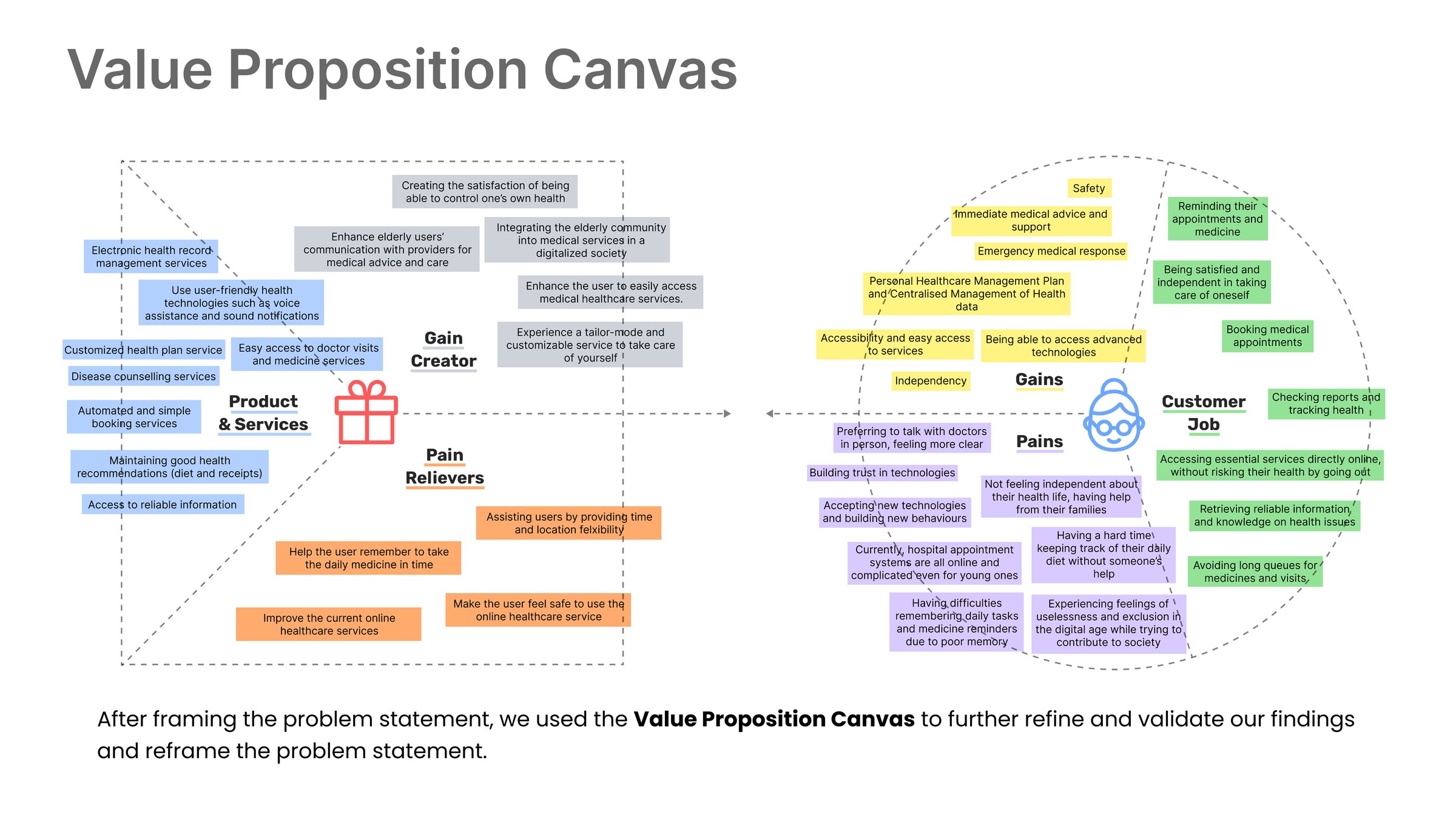
Value proposition canvas: gain creators and pain relievers on the product side, matched against the customer's jobs, gains and pains, covering medical records, reminders, independence and access to services
After the problem statement, the value proposition canvas was used to test whether the proposed product actually answered the pains we had recorded, rather than the ones we assumed. Several early ideas did not survive this step.
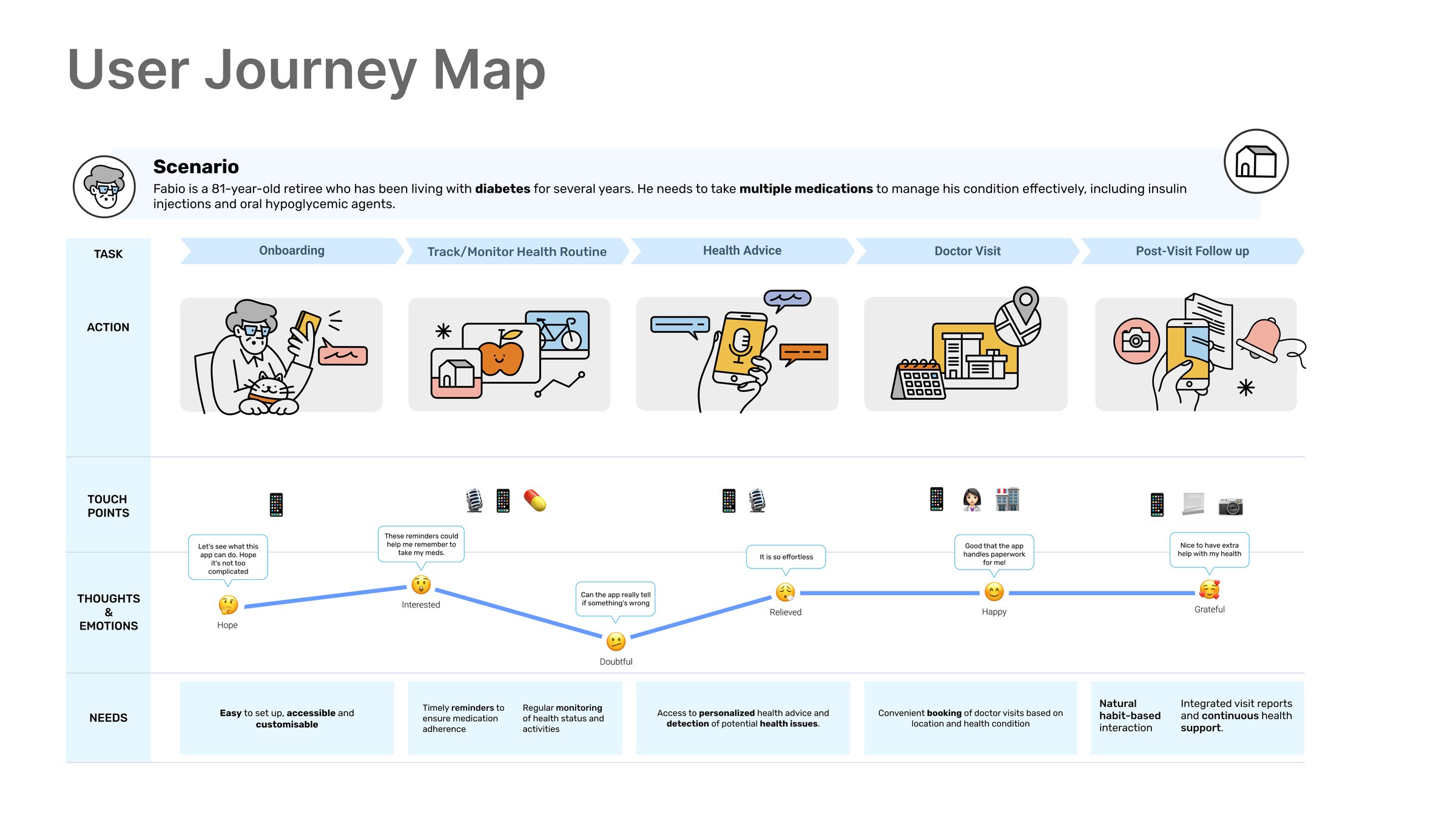
User journey map for Fabio, an 81-year-old retiree with diabetes, across onboarding, tracking the health routine, health advice, the doctor visit and post-visit follow-up, with tasks, actions, touchpoints, an emotional curve and needs at each stage
The journey map is where the emotional curve mattered more than the task flow. It dips hardest at the point of setting things up and again at the doctor visit, which is what pushed onboarding and appointment support to the top of the feature list.

Problem statement

Elderly people (75+) need tailored help to use online healthcare platforms.

Who: people typically aged 75 and above, with low technological proficiency. What: healthcare services are transitioning online, which makes managing their own health independently harder, not easier. Why it matters: they need timely medical care, they want to stay independent, and they should not be marginalised by a digitalisation they did not ask for. How: use AI to give personalised support for reaching medical services, and simplify the process enough that the person stays in charge of it.
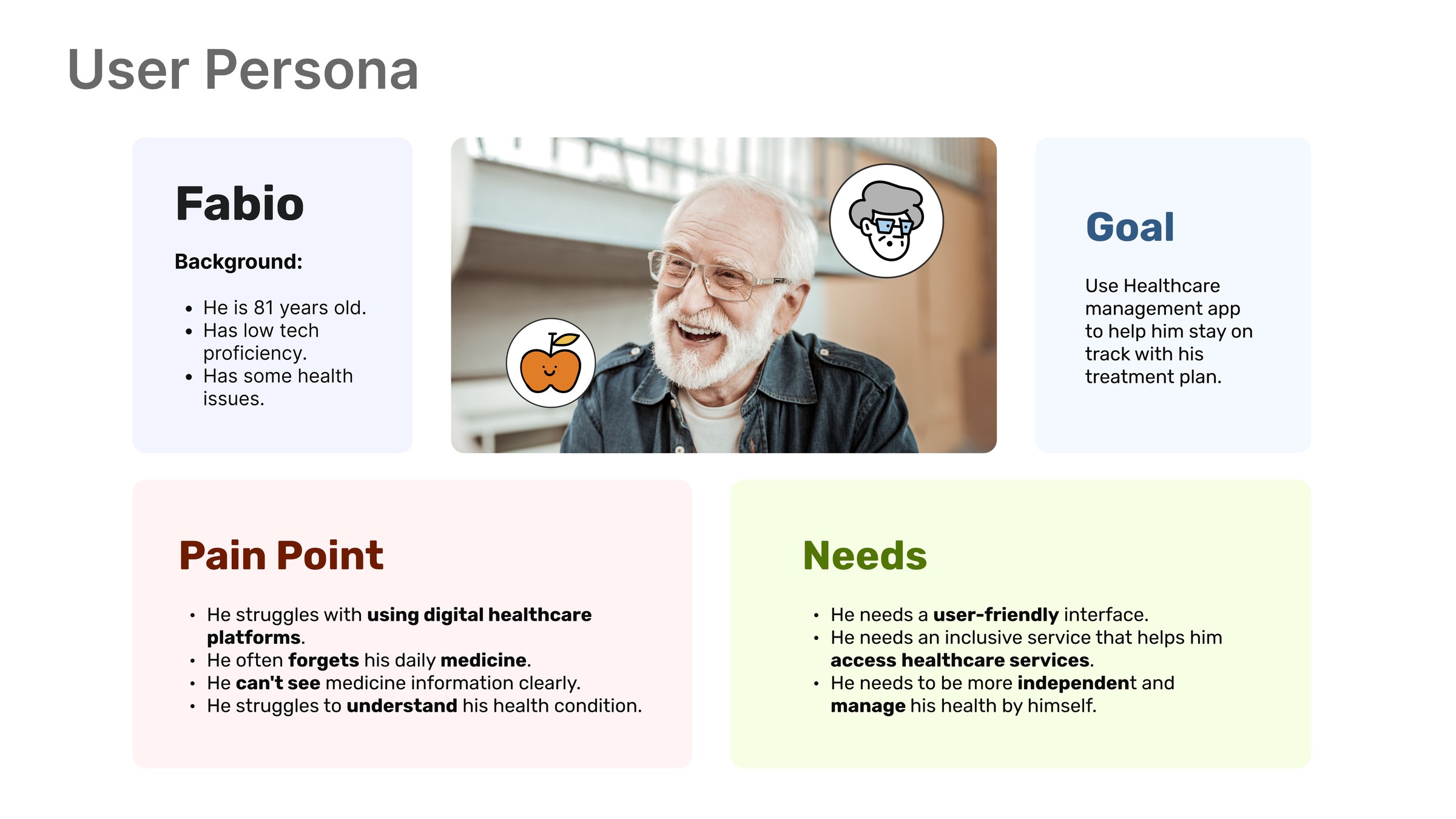
User persona board: Fabio, 81, with his goal, pain points and needs
Fabio, 81. He forgets his daily medicine, cannot read the information on the packet, and cannot tell from the app whether his health is getting better or worse.

03 / The AI system

Four models, one architecture, and an honest question about the reward.

A dialogue manager handles natural language and speech, text detection reads what the camera sees, a decision-support layer learns which suggestions get acted on, and an anomaly layer watches the health data. The architecture had to stay legible to a reader who will never look at the model choice.
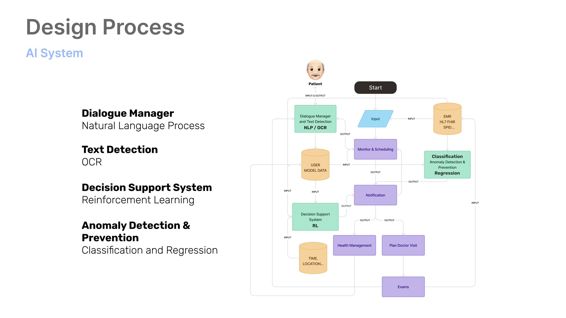
System architecture: the patient enters through a dialogue manager using natural language processing and OCR, which routes to monitoring and scheduling, notification, decision support using reinforcement learning, health management and plan doctor visit, drawing on a user model and electronic health records
The four subsystems and what each is for. Dialogue manager for natural language and OCR, decision support on reinforcement learning, anomaly detection on classification and regression, all reading the same user model.
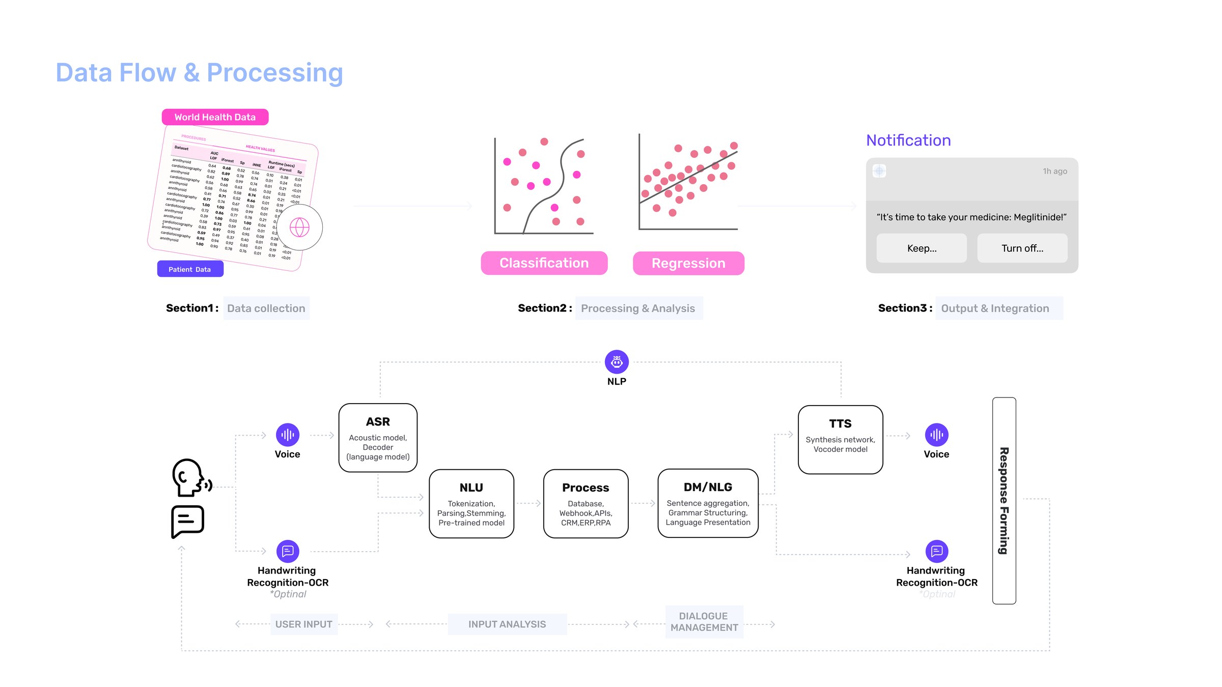
Data flow: voice and handwriting enter through automatic speech recognition and OCR, pass through natural-language understanding, processing and dialogue management with natural-language generation, then text-to-speech returns a spoken response, arranged as user input, input analysis and dialogue management
The speech path in full. Voice in through ASR, handwriting and packaging in through OCR, and the response out through TTS. Input runs through voice and camera as well as touch because the research said small print and typing were both real barriers.
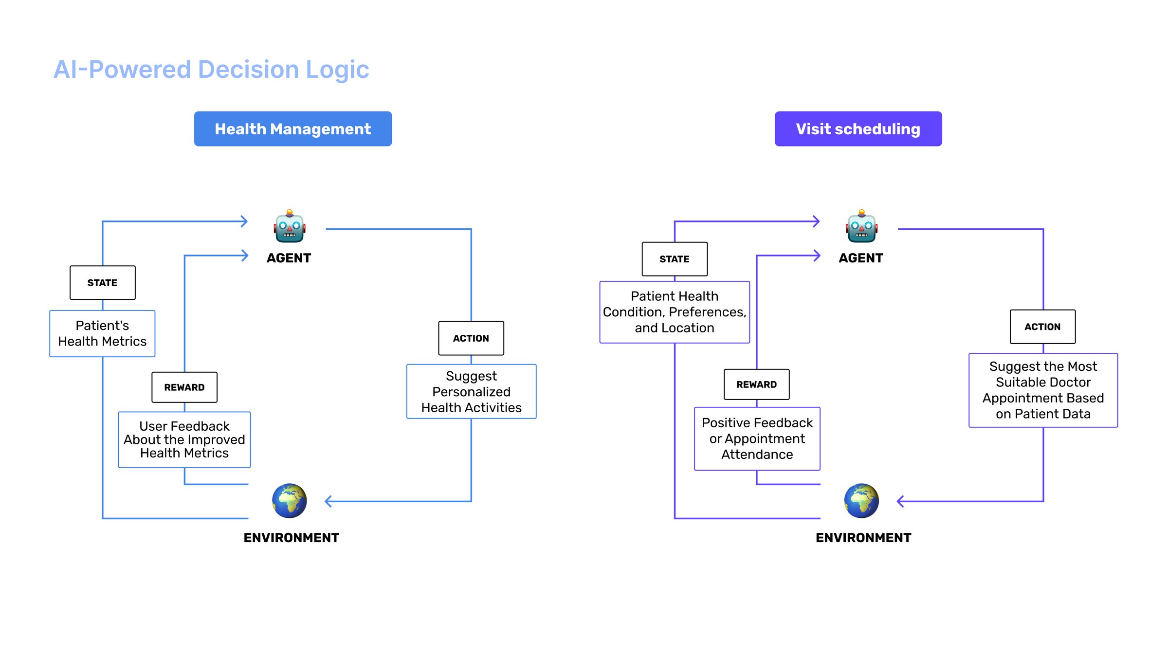
AI-powered decision logic: two reinforcement-learning loops. Health management reads patient health metrics as state, suggests personalised activities as action, and takes user feedback about improved metrics as reward. Visit scheduling reads condition, preferences and location, suggests a suitable doctor appointment, and takes positive feedback or attendance as reward
Two reinforcement-learning loops, and the reward is the part that matters. The system is not optimising for engagement: health management is rewarded by a metric that improved, and visit scheduling by an appointment that was actually attended.

Framing both as state–action–reward loops forced an honest question about the reward: the system is not optimising for engagement, it is optimising for a health metric that improved or an appointment that was kept. Input runs through voice and handwriting recognition as well as touch, because the research said reading small print and typing were both real barriers.

04 / The service

One place, and a voice for when the screen is too much.

01

Voice assistant

Always on, and able to complete the task rather than just answer about it. For someone who has decided they are not a technology person, speaking is not learning an interface.

02

Camera

Trouble reading the small text on a medicine packet: take a picture and get the information back legibly. This came straight out of Fabio’s pain points.

03

Anomaly detection

Health tracked in easy-to-read graphs, with the system flagging when something moves in the wrong direction, so noticing does not depend on the person interpreting a chart.
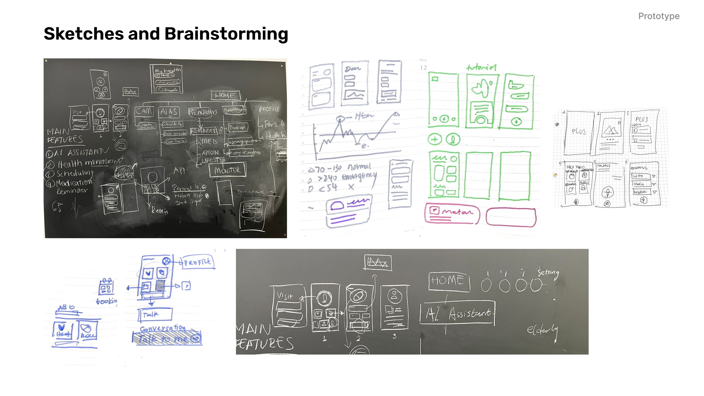
Sketches and brainstorming: whiteboard photographs of the main features and the AI assistant flow, alongside hand-drawn wireframe sets exploring layouts for the home screen, health tracking and booking
Before any of it was a screen. The whiteboards fix what the app is for; the wireframes are where the large-target, single-task-per-screen decisions were made.
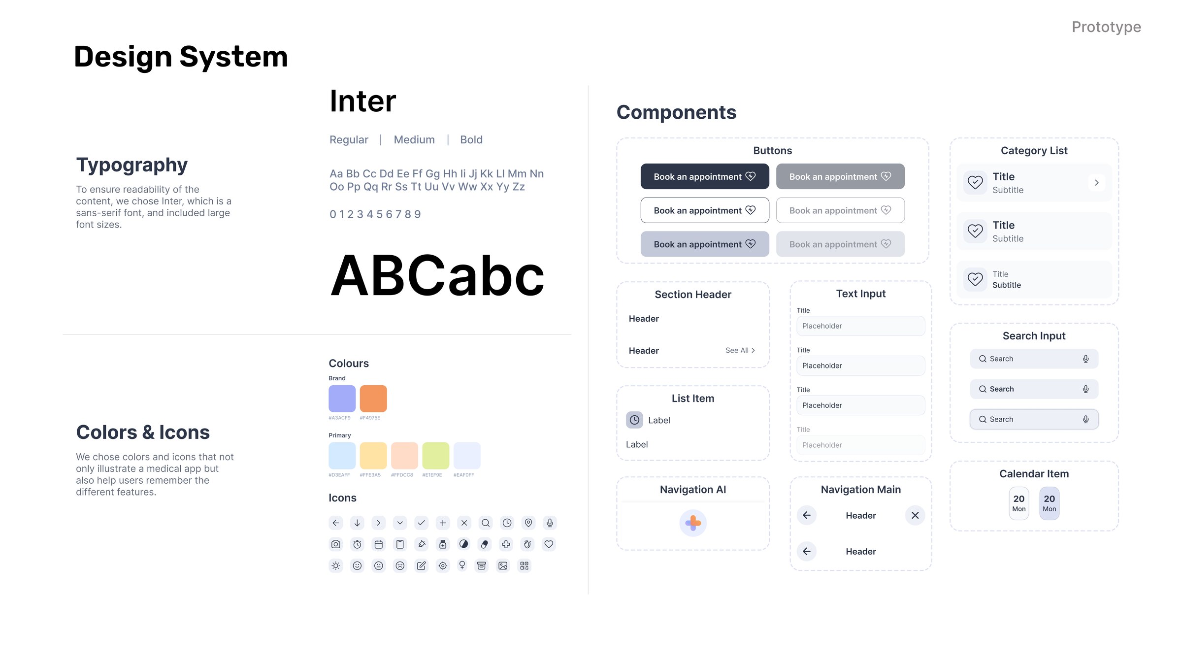
Design system: Inter typeface in regular, medium and bold at enlarged sizes for readability, a colour palette illustrating a medical app while helping users remember features, an icon set, and components including buttons, list items, text inputs, search, navigation and calendar items
Inter, set larger than a general-audience app would use, and a palette chosen to be memorable per feature rather than decorative. Colour is doing navigational work here, not brand work.
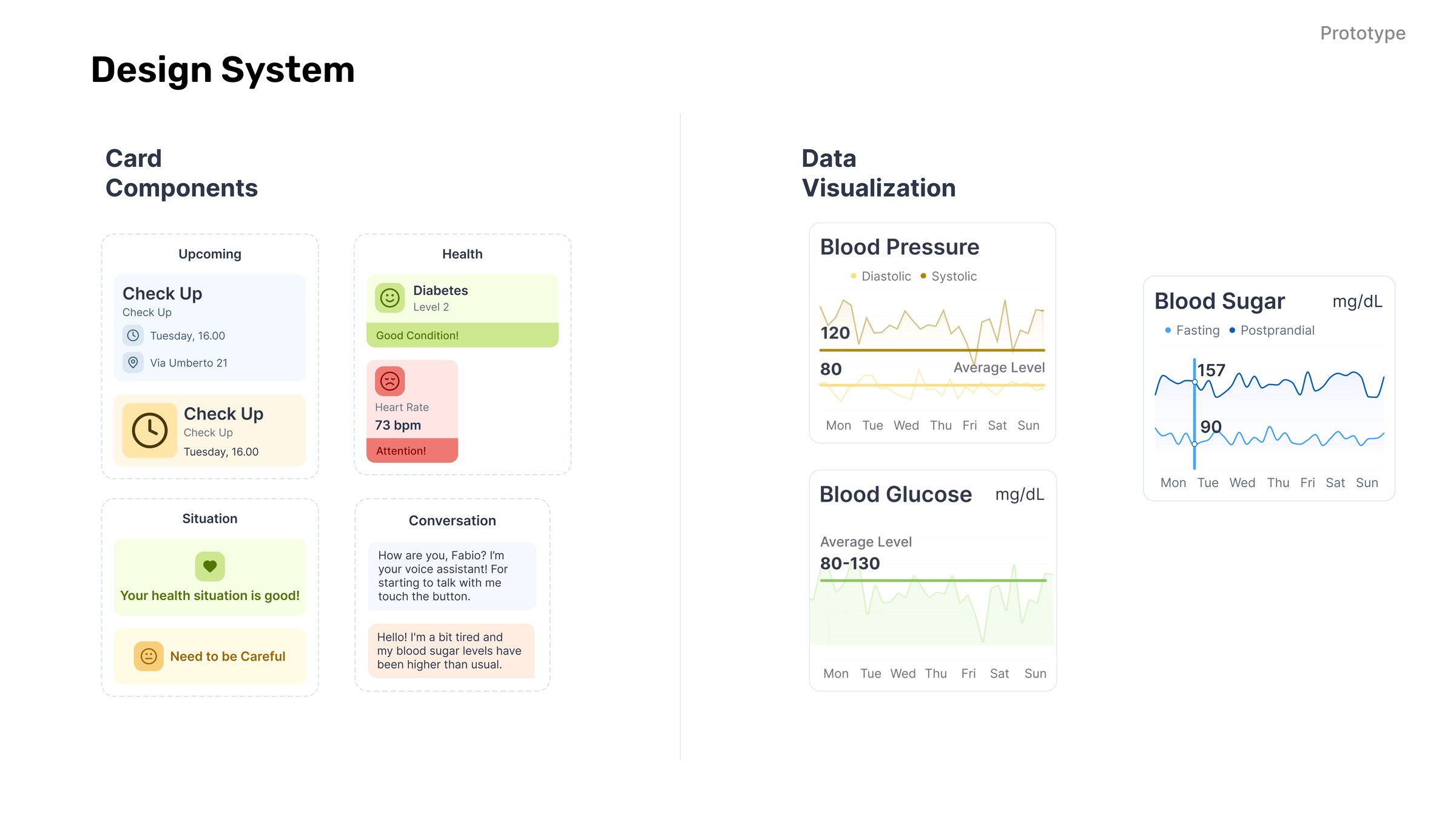
Design system continued: card components for upcoming appointments, health status, situation and conversation, and data visualisation for blood pressure, blood sugar and blood glucose with average bands marked
Every chart carries its normal band, so a reading is legible as fine or not fine without the person having to know the threshold.
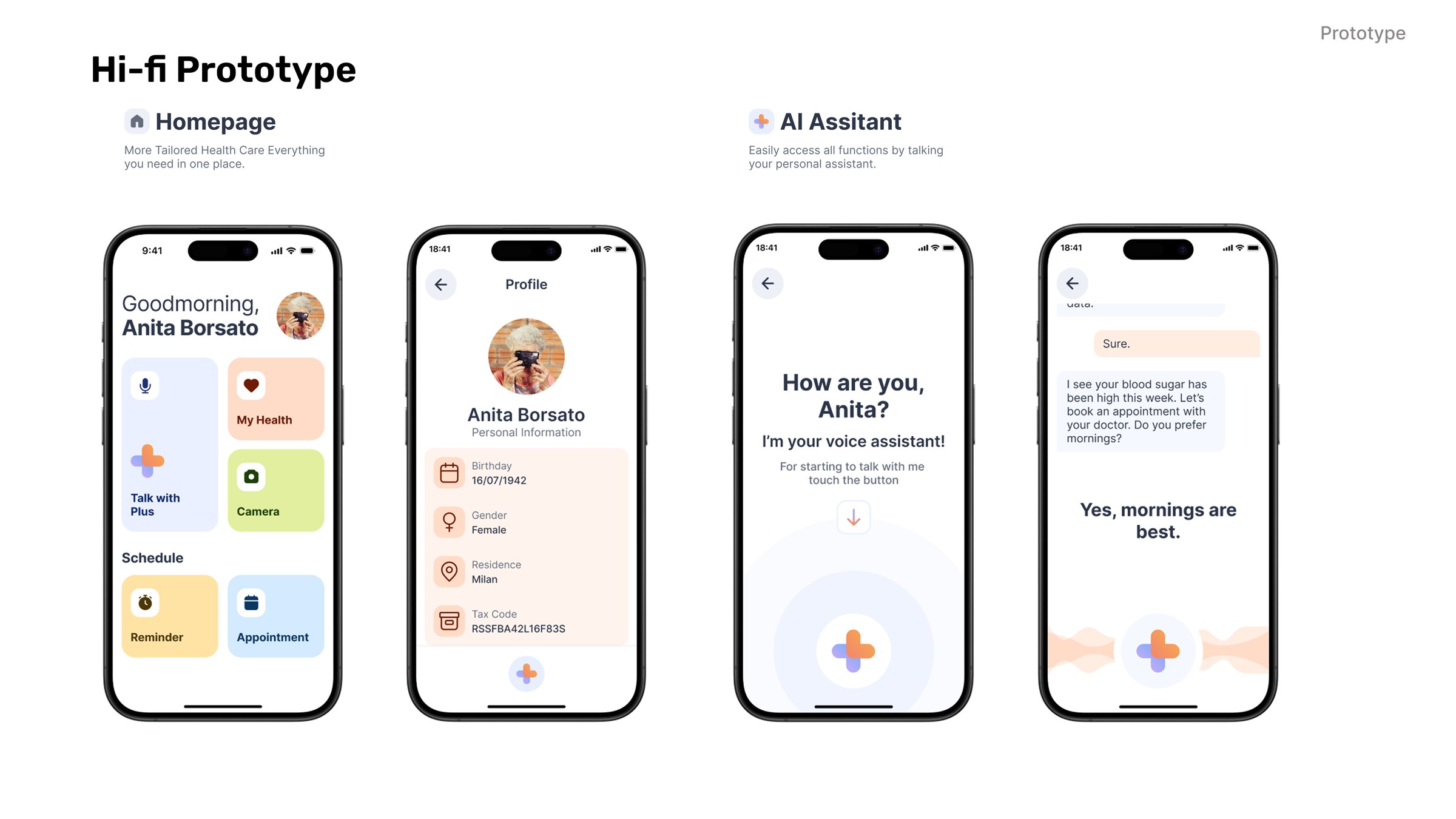
High-fidelity prototype: the home page giving access to everything in one place, the profile screen, and the AI assistant asking how are you with a spoken reply about blood sugar and a suggestion to book an appointment
The built prototype, running in ProtoPie. The assistant opens with a question rather than a menu, which is what made it usable by someone who would not have started from a home screen.

Six features

Each one is the same pipeline with a different model behind it.

Every feature reads as input, analysis and output, so the architecture stays legible without the model choice. What changes between them is the method and what the person actually has to do.
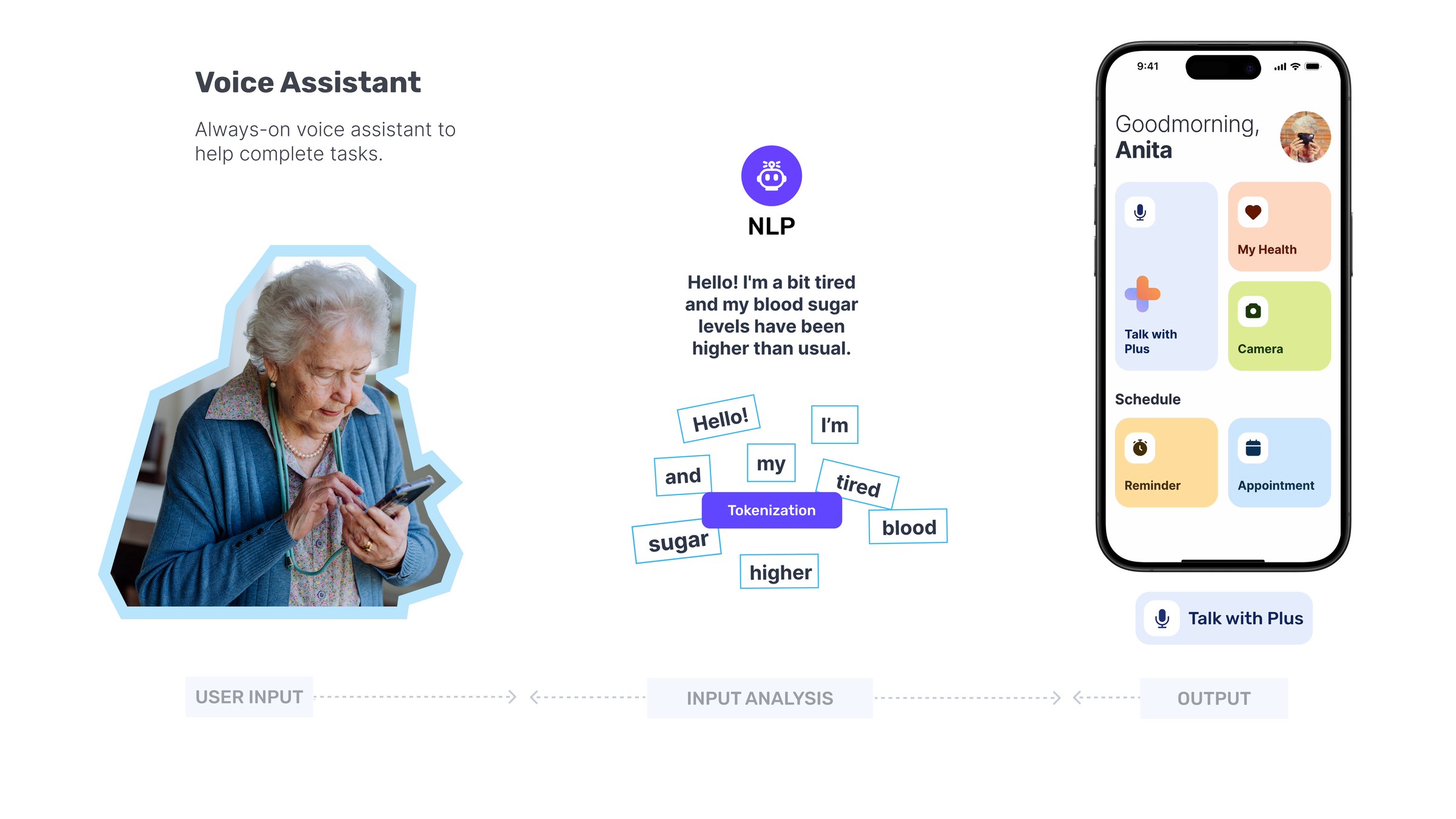
Voice assistant: an always-on assistant helps complete tasks. A spoken sentence about feeling tired with higher blood sugar is tokenised by a natural-language model, and the output appears on the home screen as a Talk with Plus control
Voice assistant. Speech is tokenised and parsed for intent, so “I’m a bit tired and my blood sugar has been higher than usual” becomes a health signal rather than a search string.
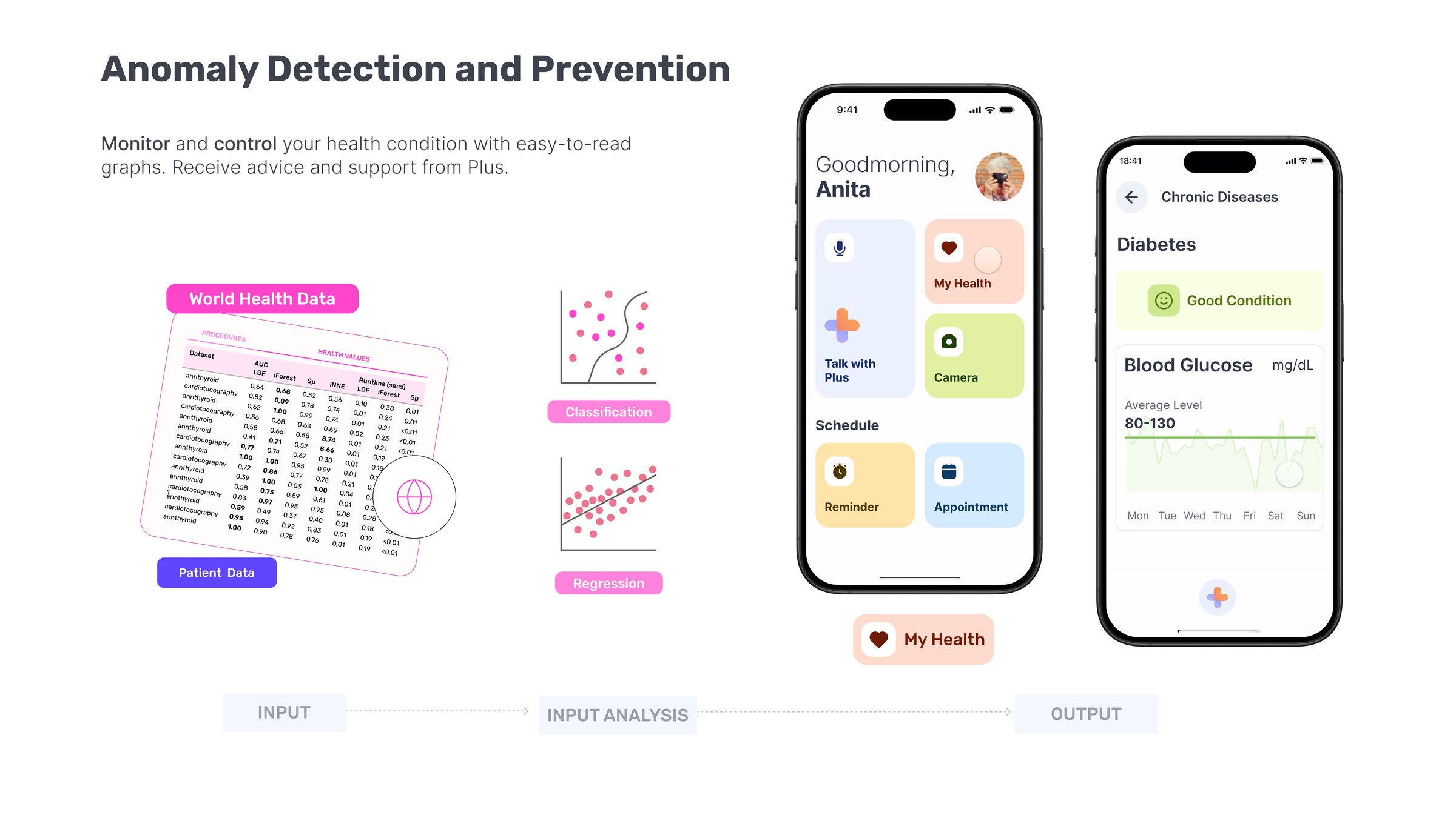
Anomaly detection and prevention: world health data and patient data feed classification and regression models, and the output is a chronic-disease screen showing blood glucose against an average band with a plain good-condition status
Anomaly detection. Population data and the person’s own readings run through classification and regression, and the result is deliberately not a number. It is a plain status, with the trend drawn against the normal band.
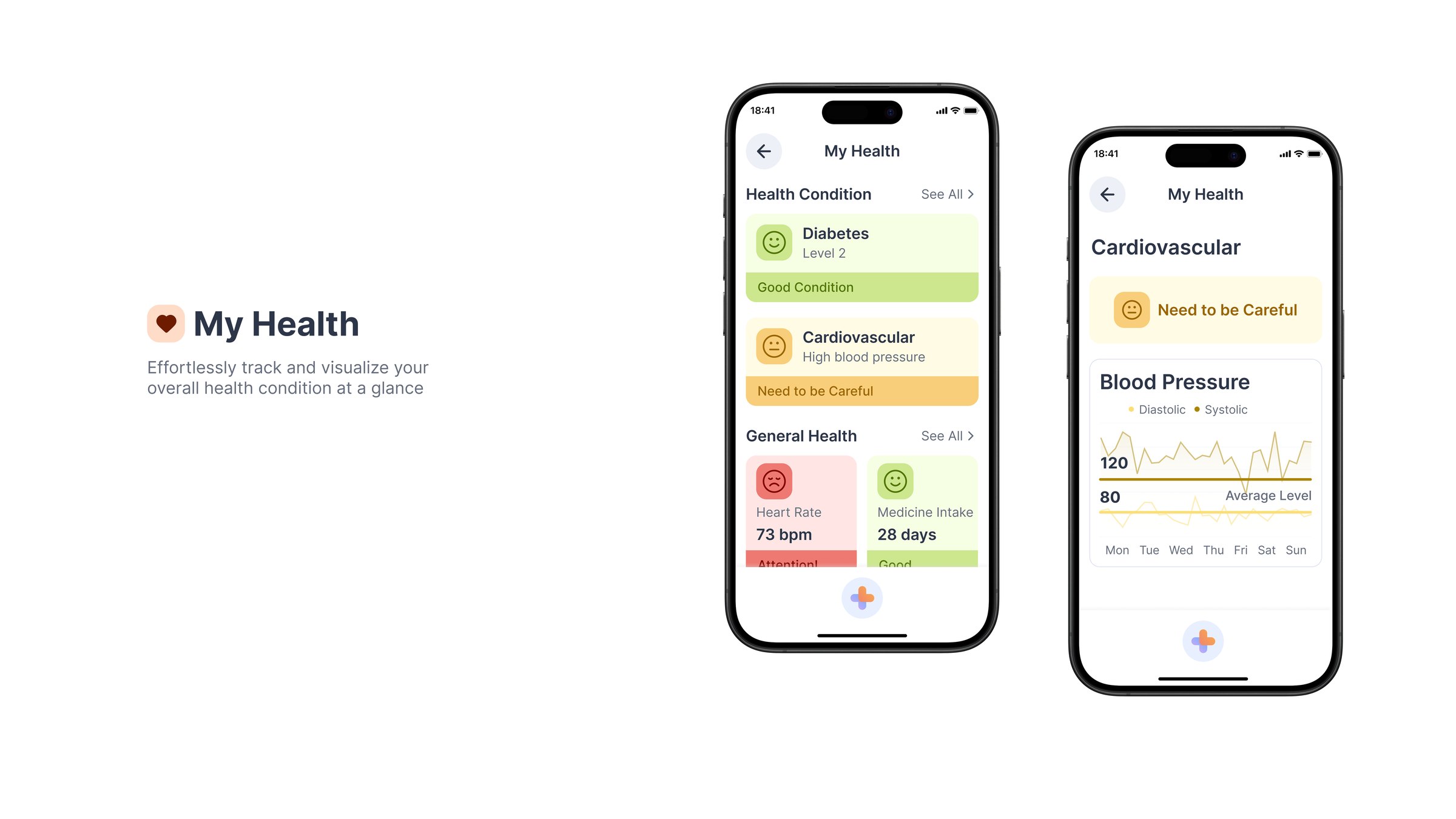
My Health: track and visualise the overall health condition at a glance, with conditions listed by status and blood pressure charted against an average level
My Health. Conditions are listed by status rather than by reading, so the first thing seen is whether something needs attention, not a figure that has to be interpreted.
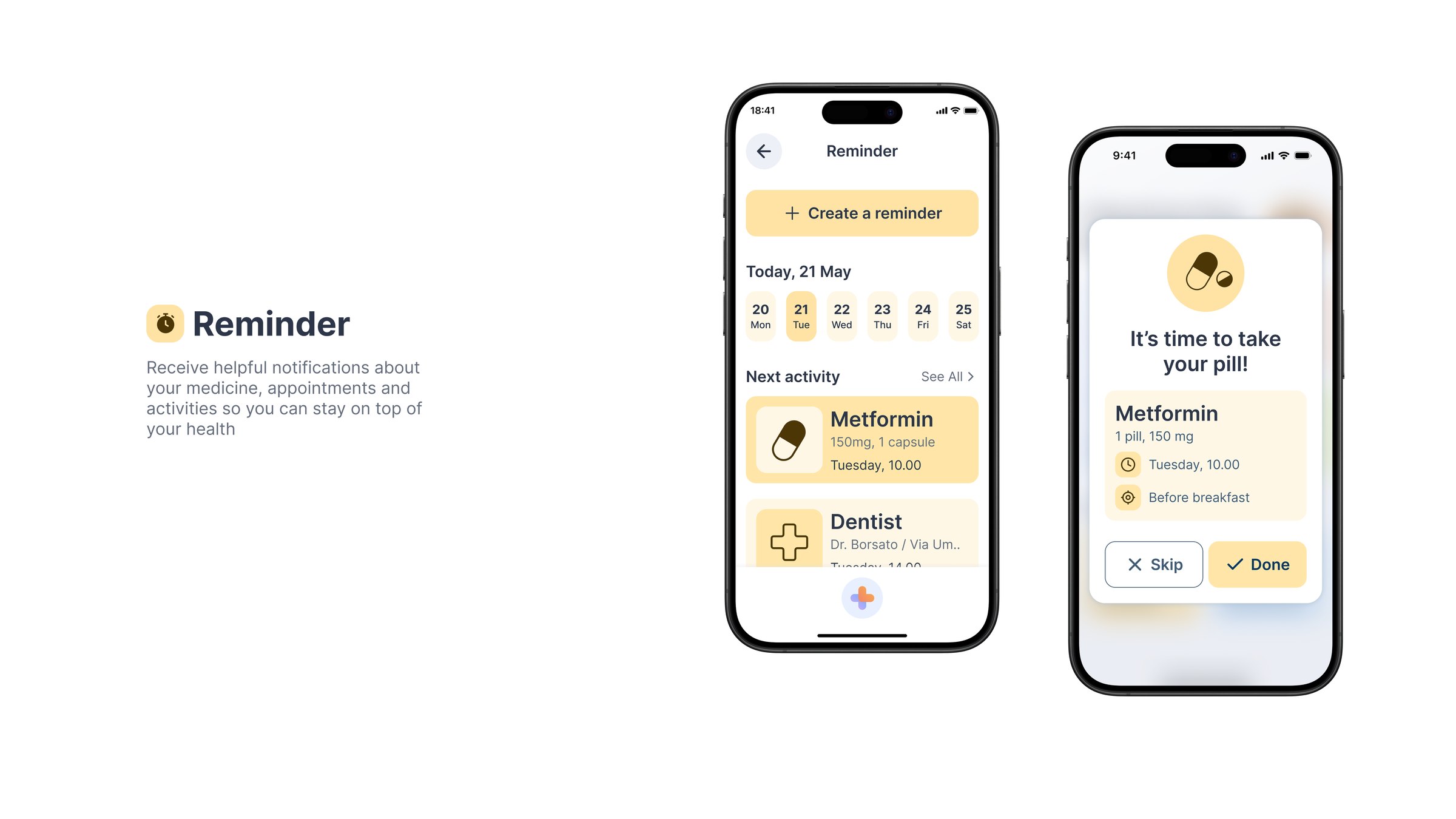
Reminder: notifications about medicine, appointments and activities, with a day view of upcoming items and a prompt to take a pill offering skip or done
Reminder. The prompt names the medicine, the dose and when it was due, and offers only two answers. Anything more becomes a decision at the moment a person is least able to make one.
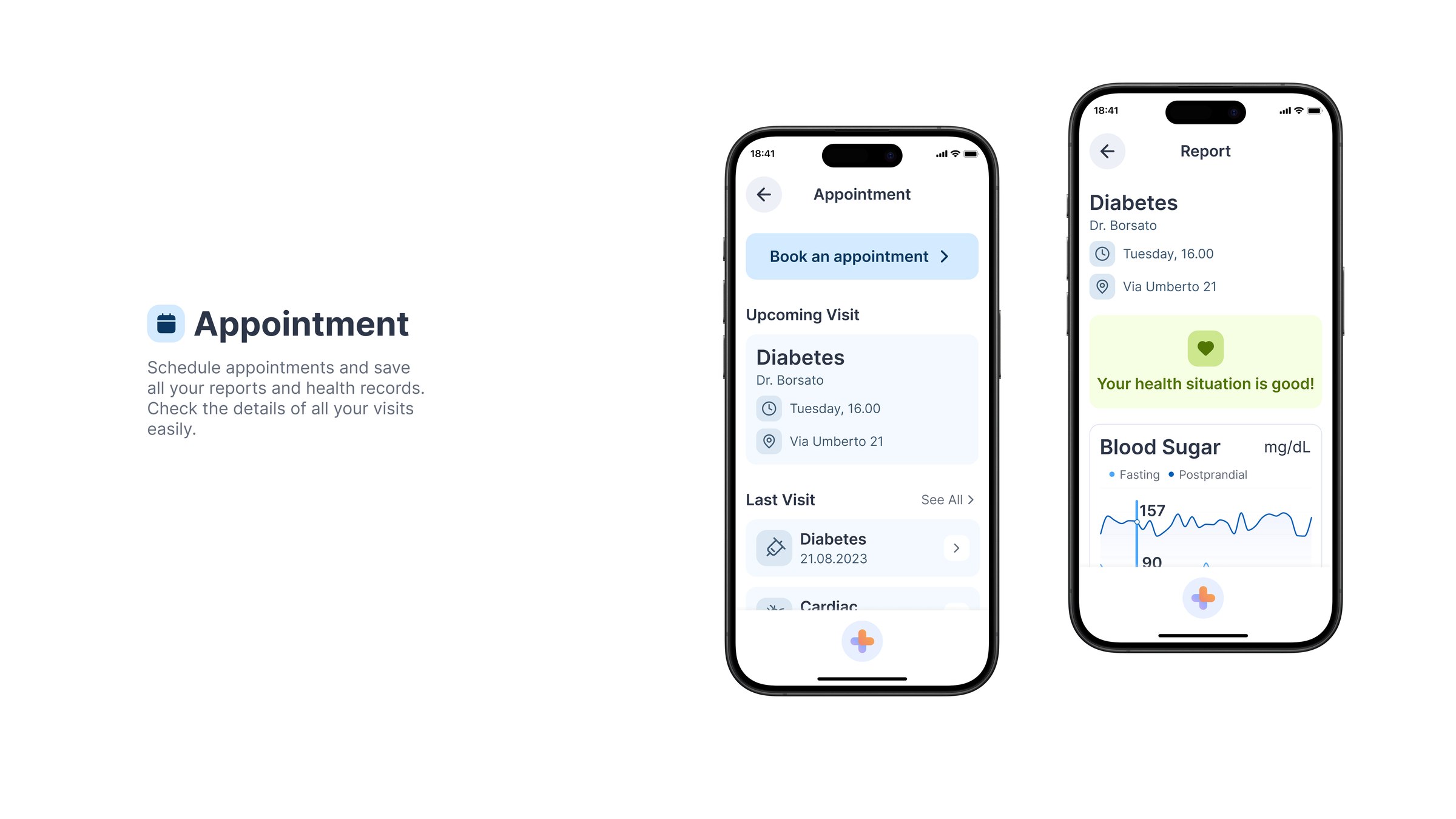
Appointment: schedule appointments and save health records, with an upcoming visit, past visits and a report screen showing the health situation and blood sugar trend
Appointment. Booking and the record of what happened live in the same place, because the research found the follow-up was where people lost track, not the booking.
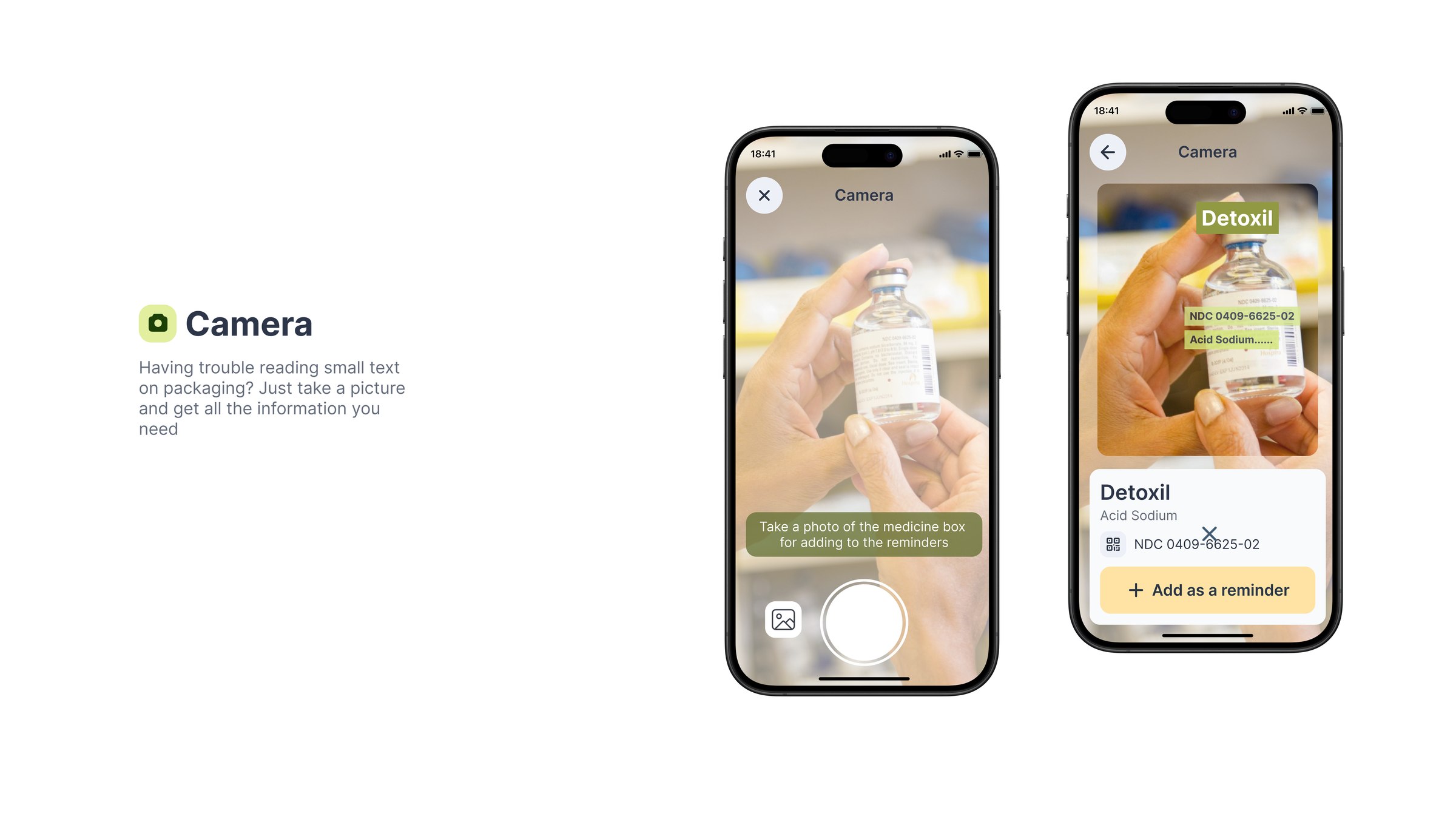
Camera: having trouble reading small text on packaging, the user photographs a medicine box and the app reads the label and offers to add it as a reminder
Text detection. The camera reads packaging and prescriptions, which removes the typing step entirely for the task people most often needed help with. This is the feature that most directly answers “help has a cost” from the research.
The service in use, end to end.

05 / Testing

We took it to the park, because that is where they are.

Rather than recruiting older adults into a lab, testing went to them, with a running ProtoPie prototype on a phone, with a laptop and notes.
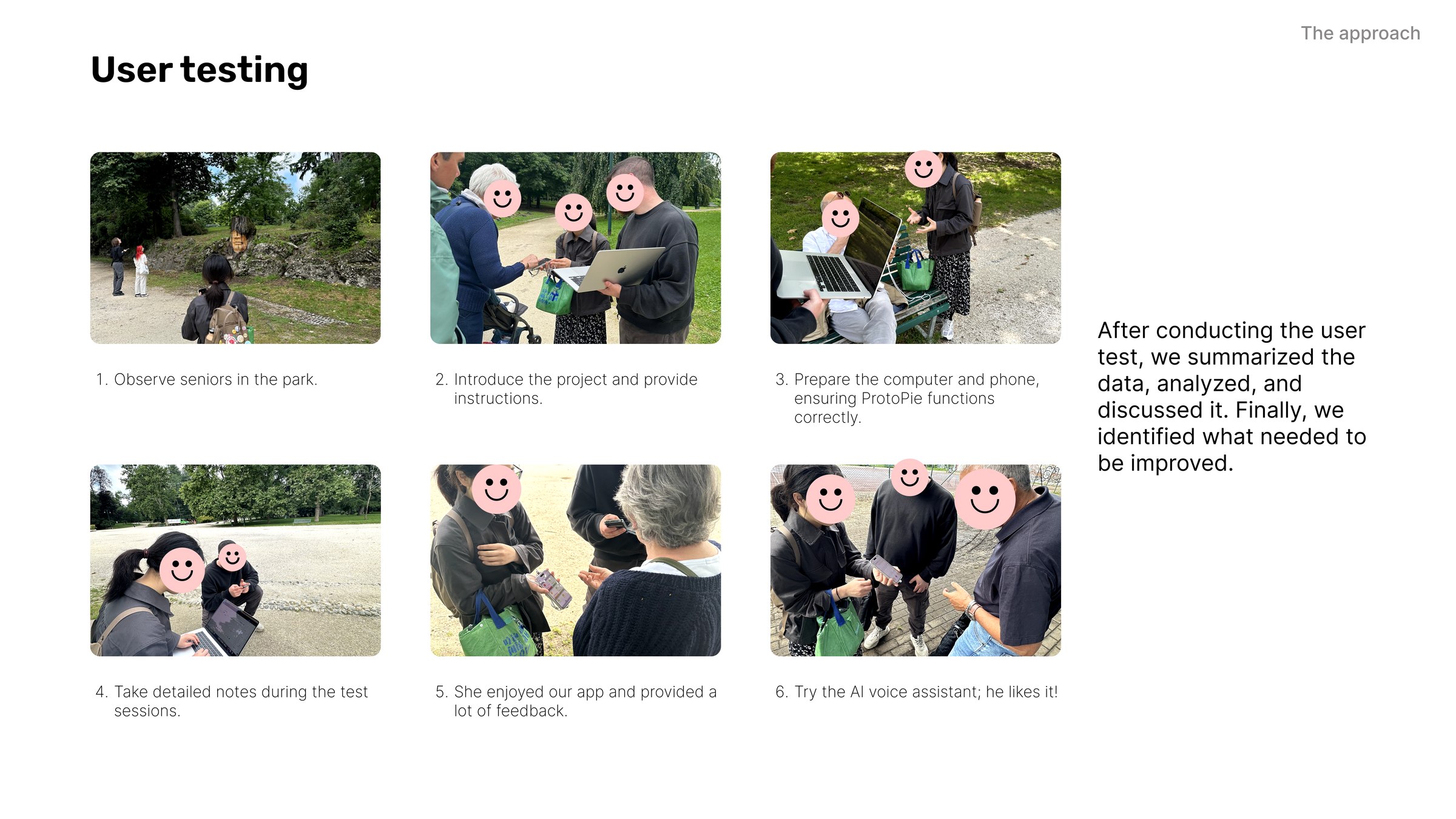
User testing board: six steps of testing with seniors in a park, with photographs of each
Observe, introduce, set up, take detailed notes, listen. “She enjoyed our app and provided a lot of feedback.” “Try the AI voice assistant; he likes it!”

Going to the park changed who could take part. Nobody had to travel, register, or be confident enough to walk into a university building, which would have filtered out precisely the participants the project was designed for.

Three things came back consistently, and all three were about the interface rather than the idea: the voice pacing was right for the age group, content was findable without help, and the large-font conversation view was the feature people named unprompted. Nobody asked what the AI was doing.
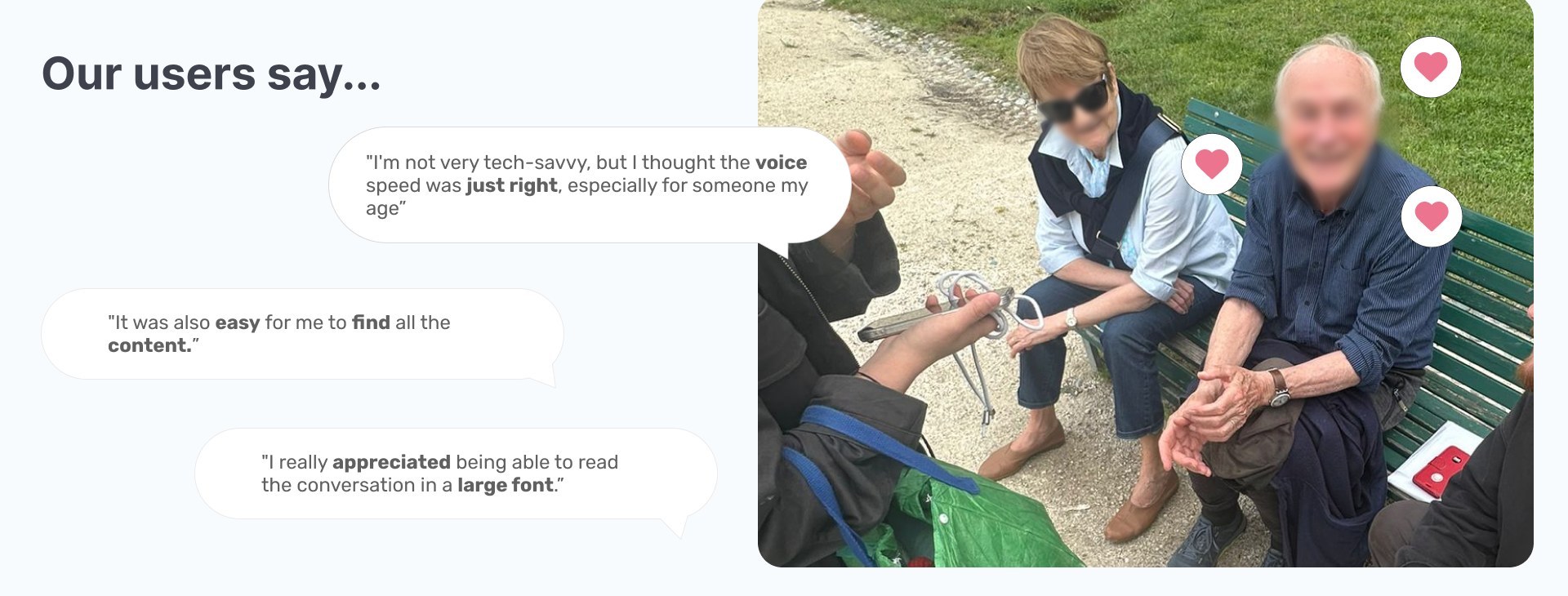
Three participant quotes beside a photograph of a testing session on a park bench: the voice speed was just right for someone my age, it was easy to find all the content, and I really appreciated being able to read the conversation in a large font
The sessions confirmed the accessibility decisions and said nothing about the models underneath, which is the right result: the reinforcement-learning loops and the anomaly detection are infrastructure, and a participant should never have to think about them. What they judged was pace, findability and legibility.
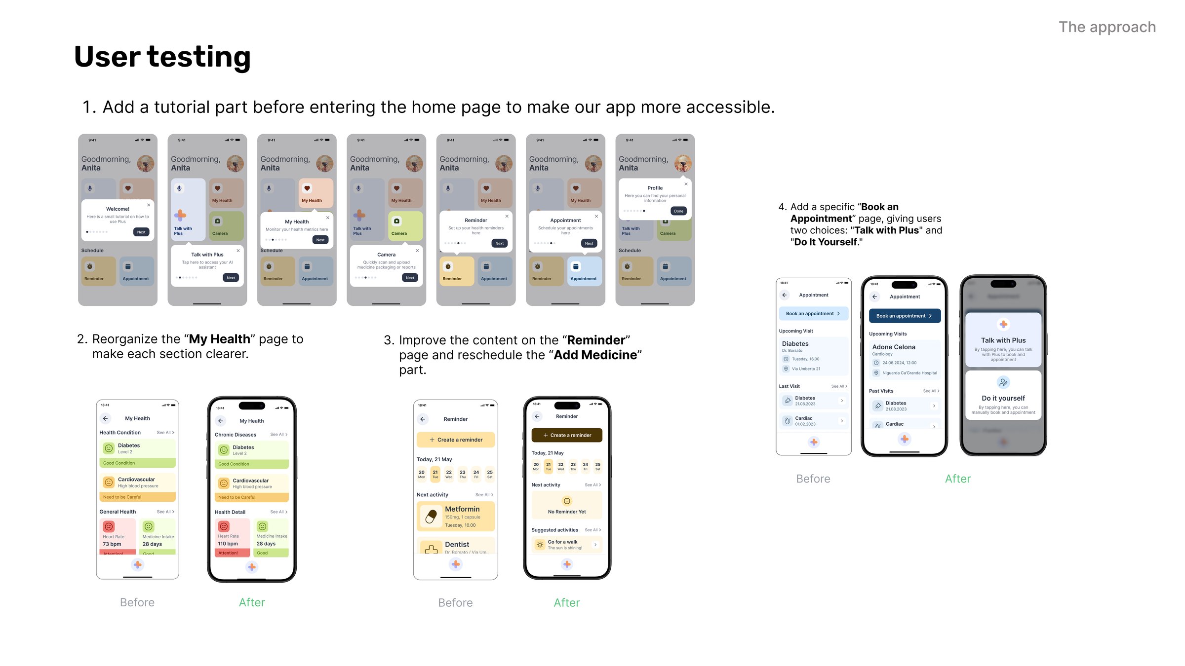
Four changes made after testing, each shown before and after: a tutorial added before the home page, the My Health page reorganised so each section is clearer, the Reminder page content improved and Add Medicine rescheduled, and a dedicated Book an Appointment page offering two routes, Talk with Plus or Do it Yourself
What the sessions actually changed, before and after. A tutorial before the home page, My Health reorganised so each section reads separately, the Reminder content rewritten with Add Medicine moved, and a dedicated Book an Appointment page offering two routes: talk to the assistant, or do it yourself. The last one matters most, because it stopped the voice assistant being the only way in.

Takeaways

What the project changed about how I work.

AI as material, not as feature.

The project deepened what I understand about how data is processed, selected and integrated into a design rather than bolted onto one. Working with older users strengthened the technical side and changed the brief at the same time: their needs are what made the case for inclusive healthcare design, not the technology.

For us the algorithms were close to a blank canvas, and making them accessible to people in their eighties was the hard part. We were learning the territory while designing in it, which is uncomfortable and is also where the useful findings came from.

Where I want to take it next.

The direction I want to pursue is a more structured validation process, optimising AI decision-making for accessibility, and a wider exploration of AI-driven healthcare interventions. That is the line running from this project into what I want to research.

The unresolved question is the one the reward function raises. Optimising for a health metric that improved, or a visit that happened, is defensible on paper; establishing that it holds up over months with the people it is built for needs a study this project did not run.
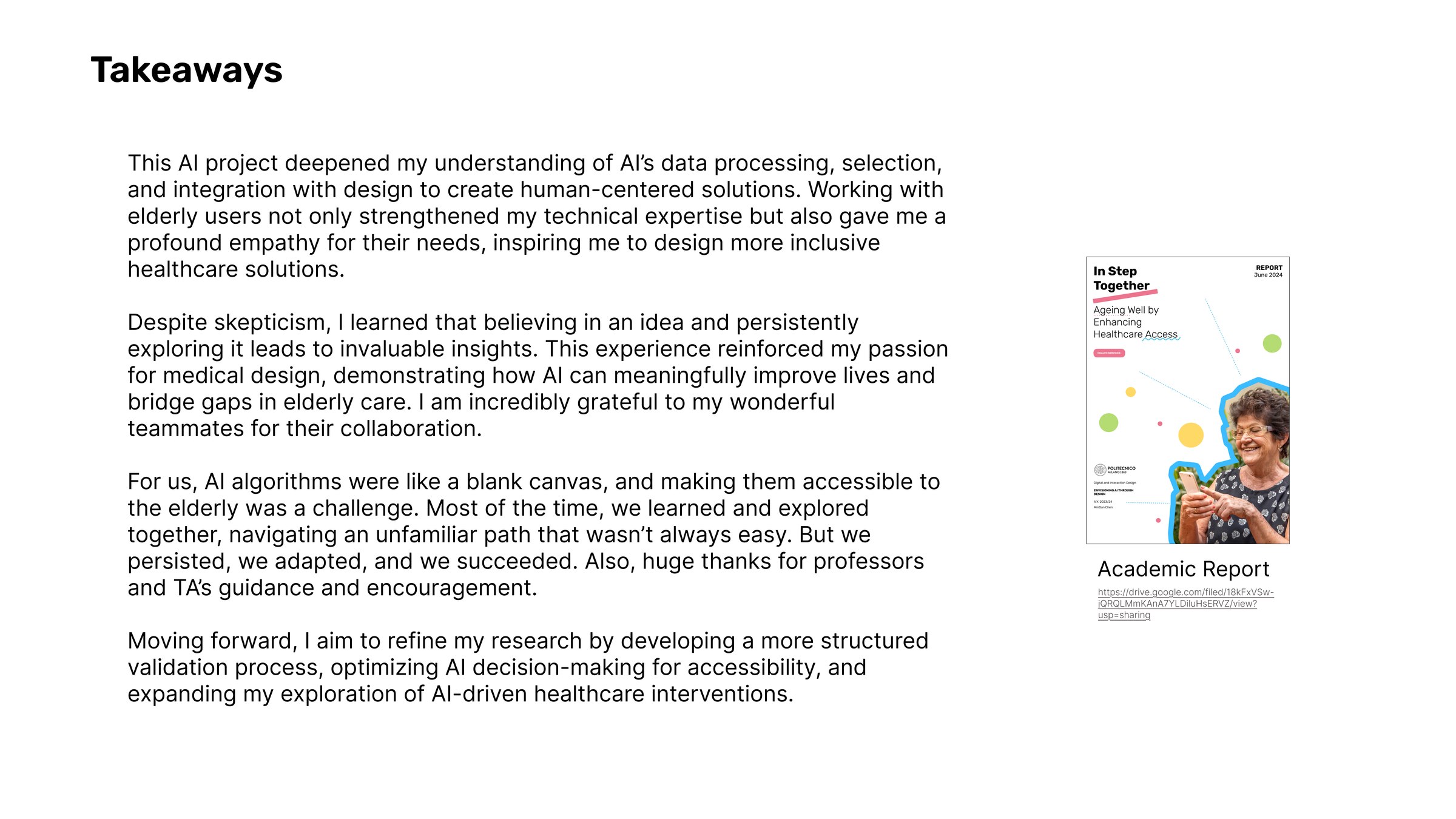
Takeaways board with the project reflection in full, beside the cover of the academic report, In Step Together: Ageing Well by Enhancing Healthcare Access, Politecnico di Milano, Envisioning AI Through Design, A.Y. 2023/24
The reflection as written at the end of the project, alongside the academic report the work was submitted as.

Next project

Ecco →