Ecco in 2035 2025

“Dad, how did the dinosaurs go extinct?”

In a museum, parents are the interface. Their child asks, and they have to turn a wall of specialist text into an answer, usually without knowing it either. Ecco is a storytelling companion for the 2035 museum, designed with Museo di Storia Naturale di Milano, that takes that pressure off the parent without taking over the conversation.
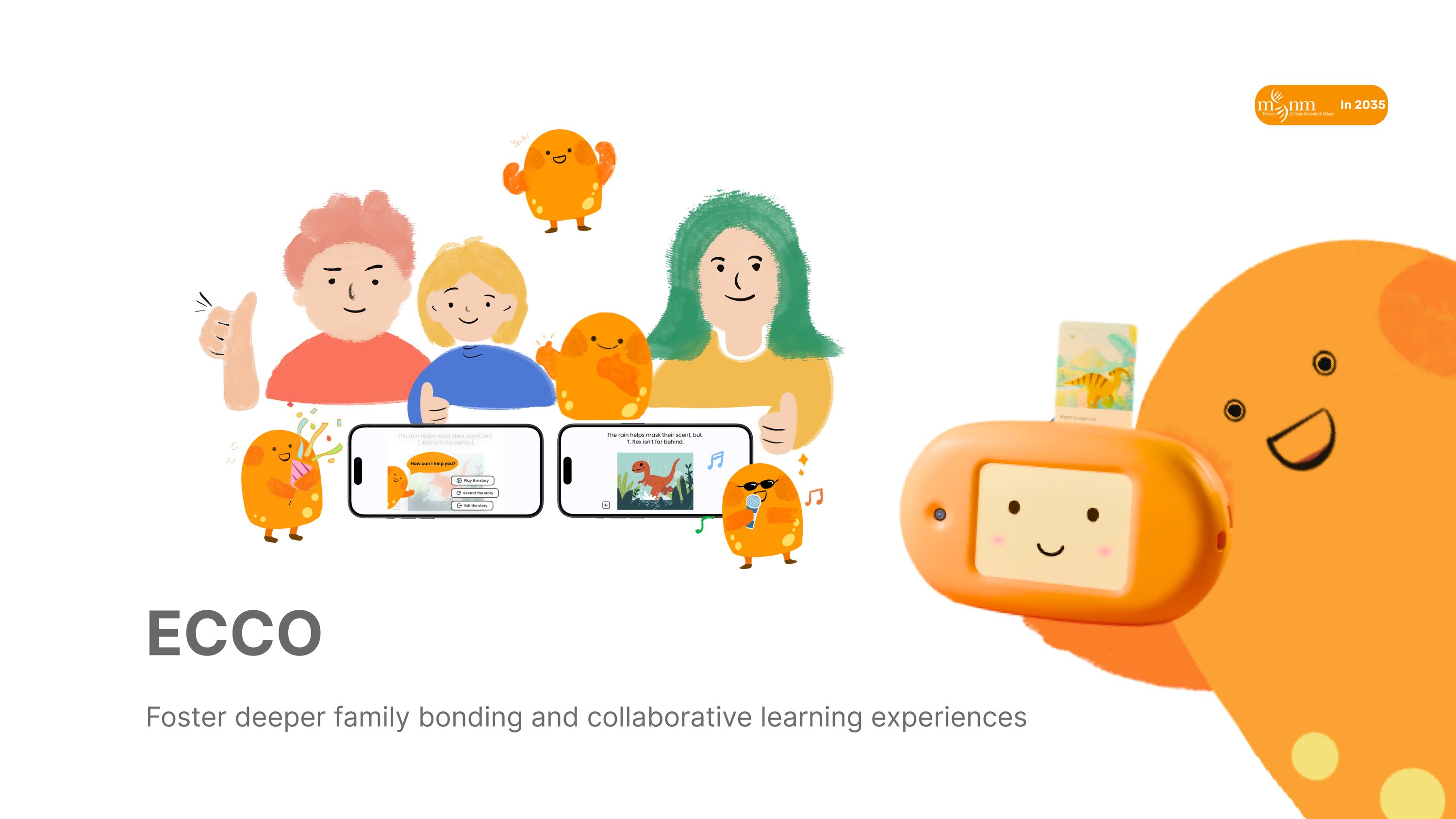
Ecco, a friendly orange handheld companion device with a screen, shown with its mascot illustration

My role

User research, context exploration, benchmarking, concept ideation, story & system design, UX/UI design & illustration, prototyping, product design, usability testing, poster design.

Timeline

Sep 2024 – Feb 2025

Sponsor

Museo di Storia Naturale
di Milano

Context

Final Design Studio
Politecnico di Milano, A.Y. 2024/25

Tools

Figma
PTC Creo
Cinema 4D
ProtoPie
Arduino IDE

Collaborators

Beyza Artunc
Roya Zareanshahraki
Guanjun Yu
Muan Cao

We worked with Museo di Storia Naturale di Milano to reimagine the 2035 museum experience: an interactive storytelling companion that makes exhibits more engaging, more educational, and, in the part that turned out to matter most, more collaborative.

The brief started from a question about the future of museums and ended somewhere more specific: not how to make exhibits smarter, but how to support the relationship already doing the explaining.

30
families observed and interviewed at the museum
52
participants in the evaluation, role‑playing family groups
2
competing MVP scenarios tested head to head
4
branching stories, one per NFC character card

01 / Context

Who the museum is built for, and who actually comes.

The studio opened on a question about the future of museums. We answered it with visitor data first: who walks through the door, and with whom.
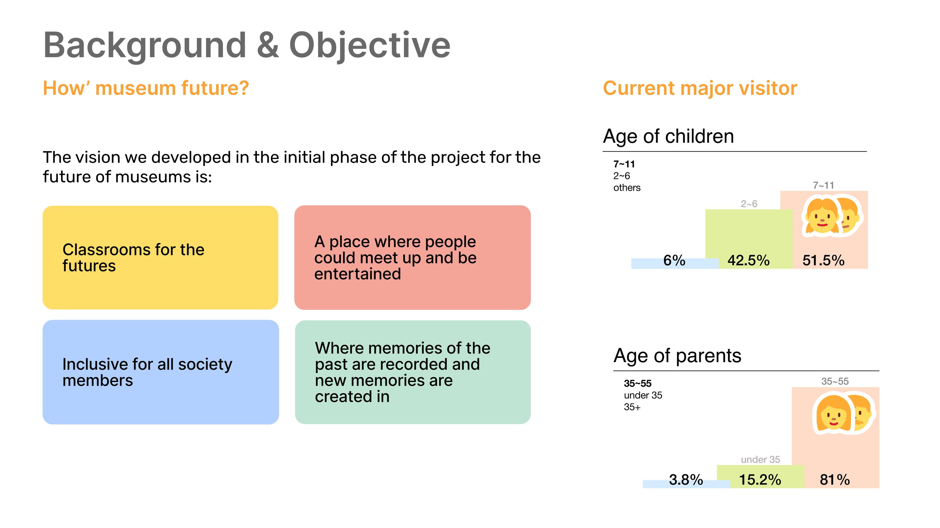
Background and objective board: four visions for the future museum, alongside visitor demographics showing children aged 7 to 11 at 51.5 per cent and parents aged 35 to 55 at 81 per cent
Four futures for the museum, set against who is in the building. The audience is not a visitor, it is a pair.

Design process

Five phases, two rounds of testing.
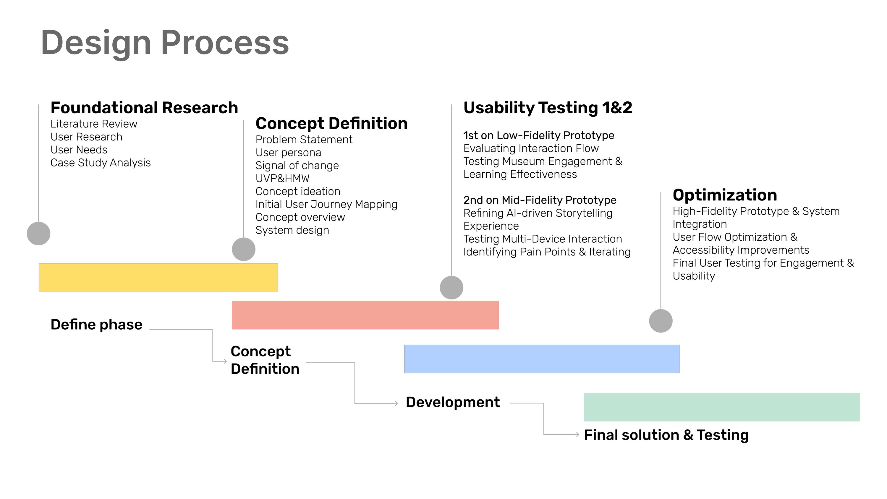
Design process timeline across five phases: foundational research, concept definition, usability testing one on the low-fidelity prototype, usability testing two on the mid-fidelity prototype, and optimisation
Testing ran twice, at low and mid fidelity, before the final build. The second round produced the changes that mattered.

02 / Research

Four ways parents and children learn together.

Literature and observation split parent–child museum interaction into collaborative learning, comparative learning, parent as mediator, and individual learning, set against what children themselves enjoy.
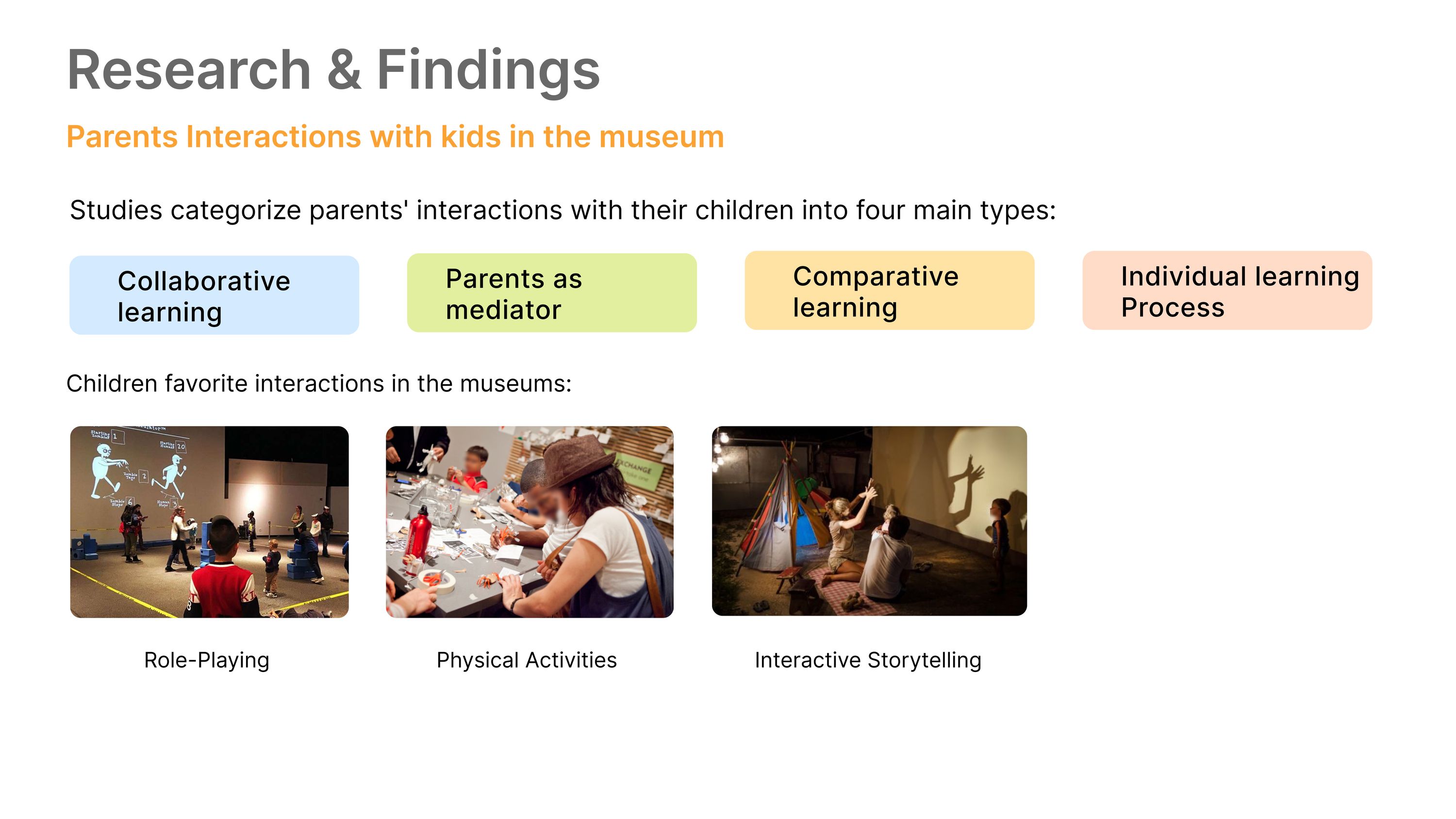
Research board: parent interactions categorised into collaborative learning, parents as mediator, comparative learning and individual learning, with photographs of children role-playing, doing physical activities and interactive storytelling
What children like is not what most museums offer: role-playing, physical activity, and being told a story.
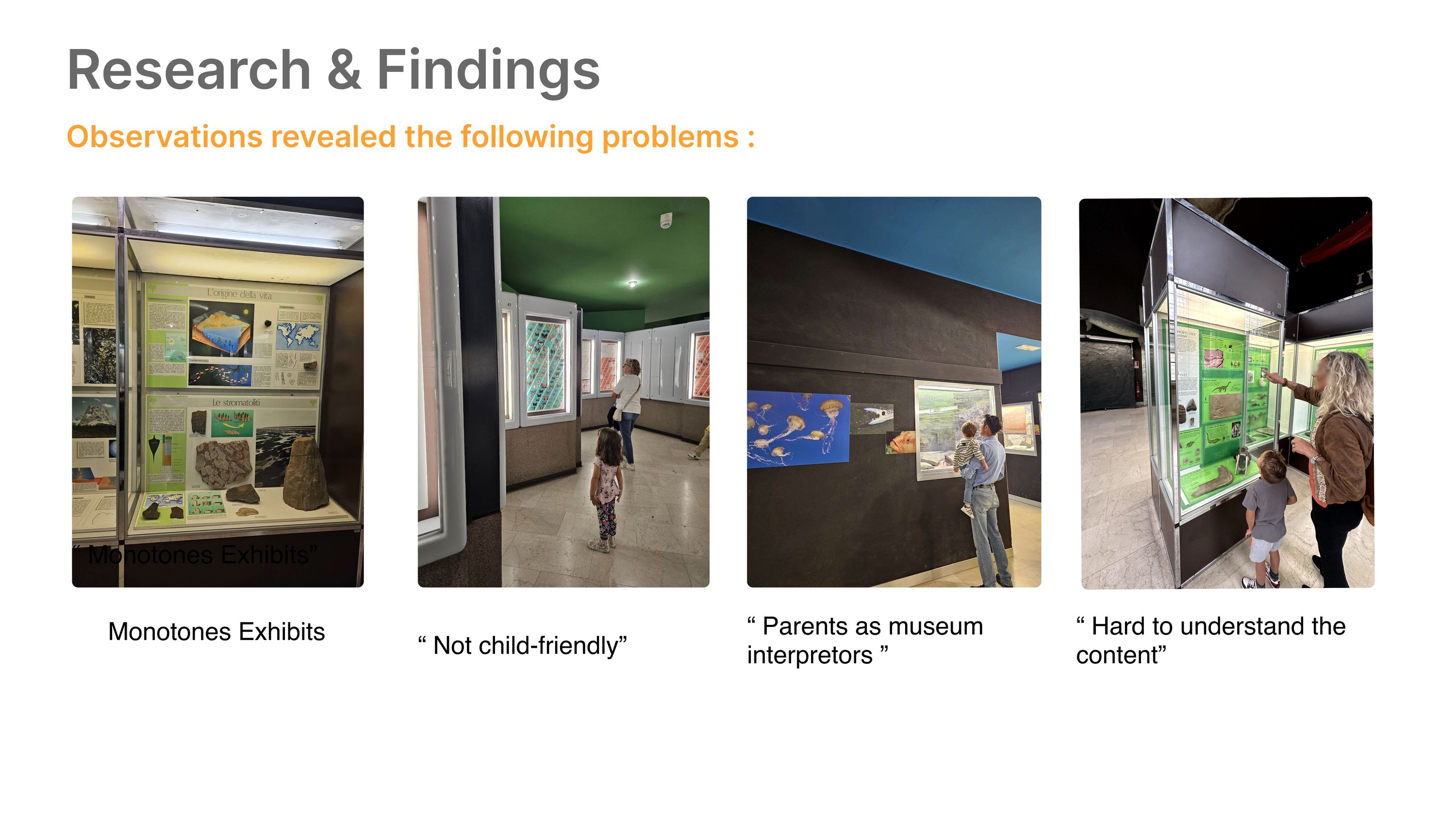
Observation board: four recorded problems illustrated with museum photographs, monotone exhibits, not child-friendly, parents acting as museum interpreters, and content hard to understand
Four problems, observed rather than assumed. The third is the one the project is built on.

Problem statement

When families visit the museum, parents act as mediators between the exhibits and their children, but they often struggle to simplify complex information and answer their children’s questions, making the experience less enjoyable and disrupting family engagement.

Reframed as

How might we create an engaging and collaborative museum experience that fosters family bonding?

03 / Users

Three people in one visit, with different jobs.

Personas were built for the child, the mother and the father separately, because they want different things from the same hour.
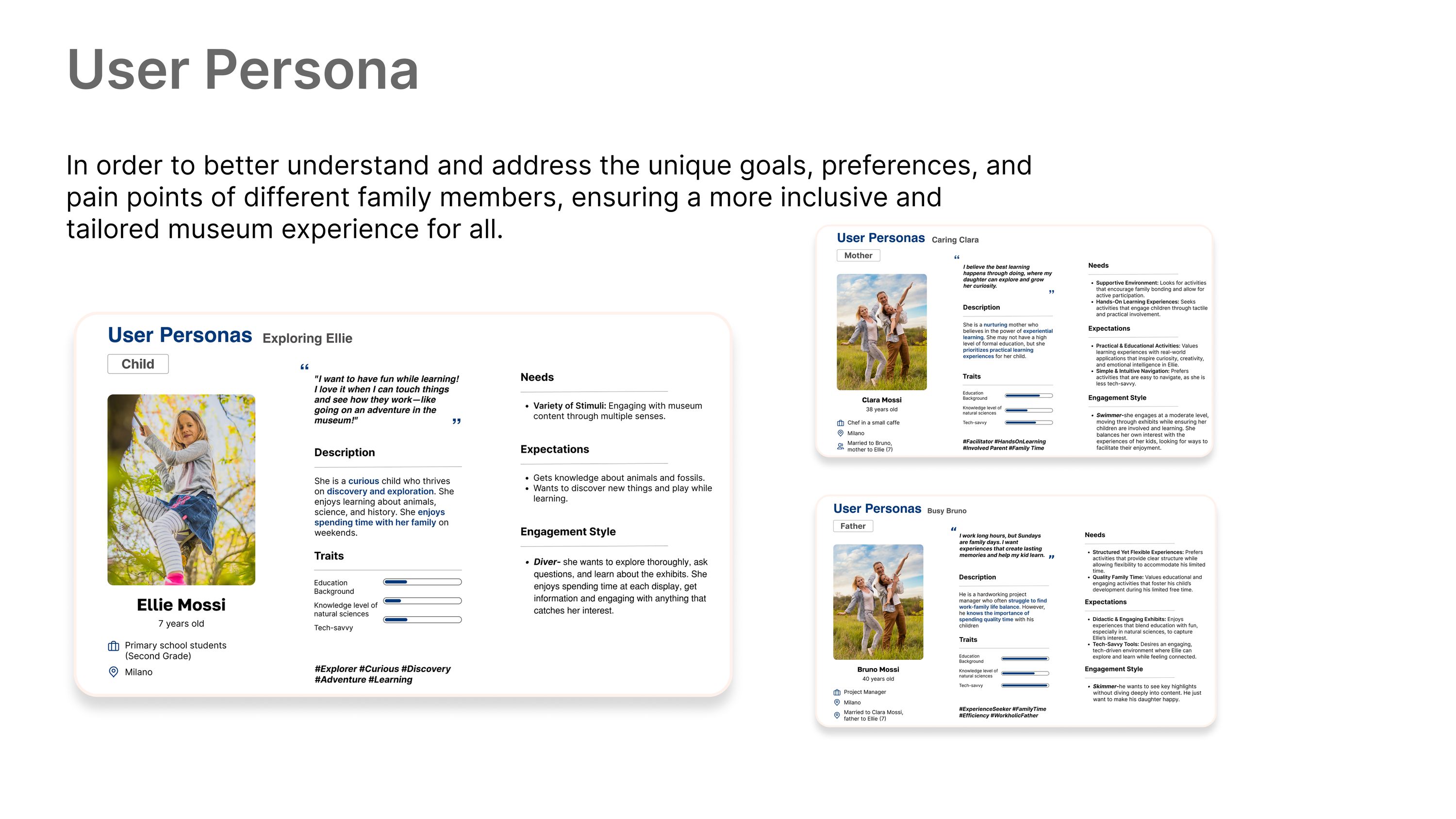
Three user personas: Ellie, a seven-year-old curious child, and her mother and father, each with needs, expectations, traits and engagement style
The child wants to play while learning. The parents want to keep up.
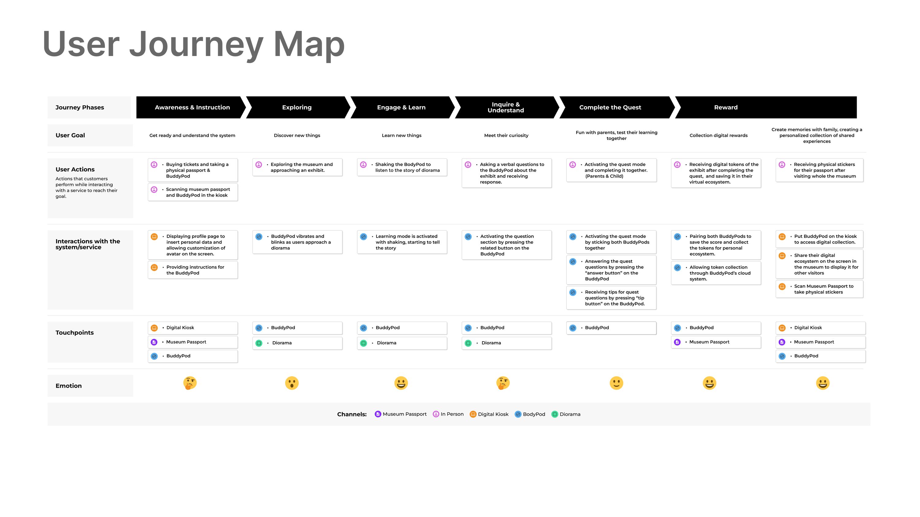
User journey map across seven phases from awareness and instruction to reward, listing user goals, actions, system interactions, touchpoints and an emotional curve
The emotional line dips at instruction and again at understanding, exactly where a parent is asked to explain something they may not know.

04 / Benchmarking

What already exists, and where the gap is.
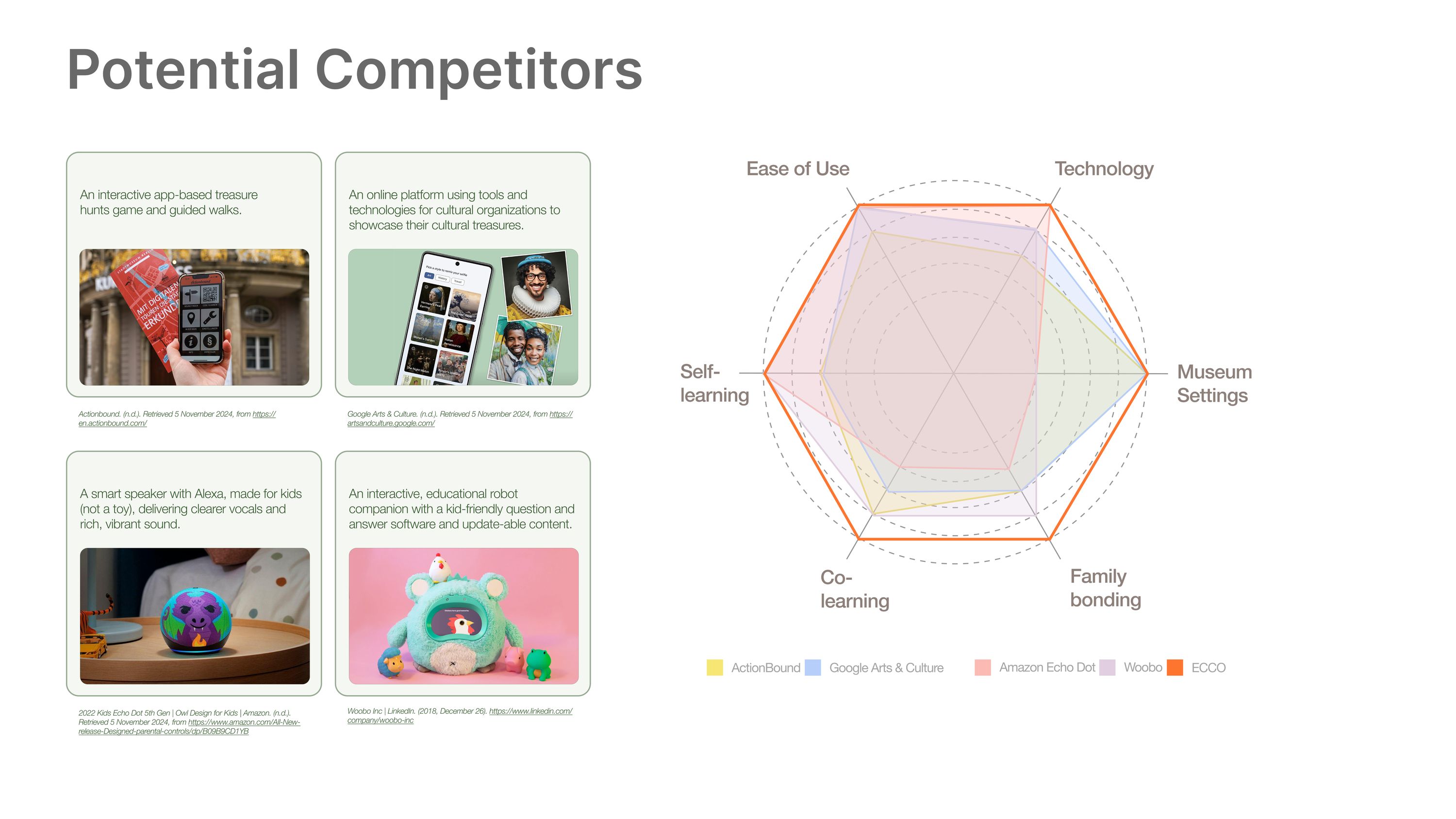
Competitor analysis of four existing products plotted on a radar chart across ease of use, technology, museum settings, family bonding, co-learning and self-learning
The gap is family bonding and co-learning. Existing products serve one learner well and a pair badly.

05 / Concept

Five ideas into two scenarios, then one.

The five initial concepts were merged into two developed scenarios and tested against each other rather than argued about.
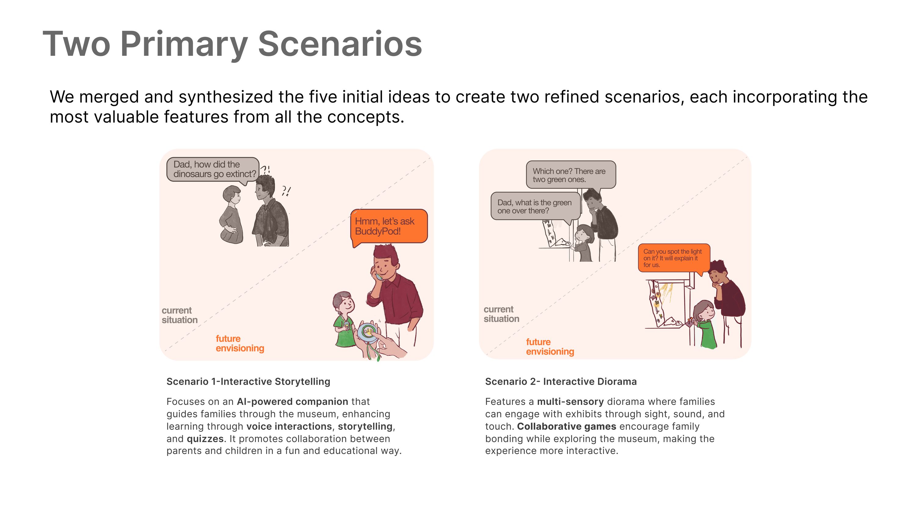
Two primary scenarios as comic strips: an AI-powered companion guiding families through voice, storytelling and quizzes, and a multi-sensory diorama engaging families through sight, sound and touch
Scenario one puts the companion in your hand; scenario two puts it in the exhibit. Only one travels with the family.
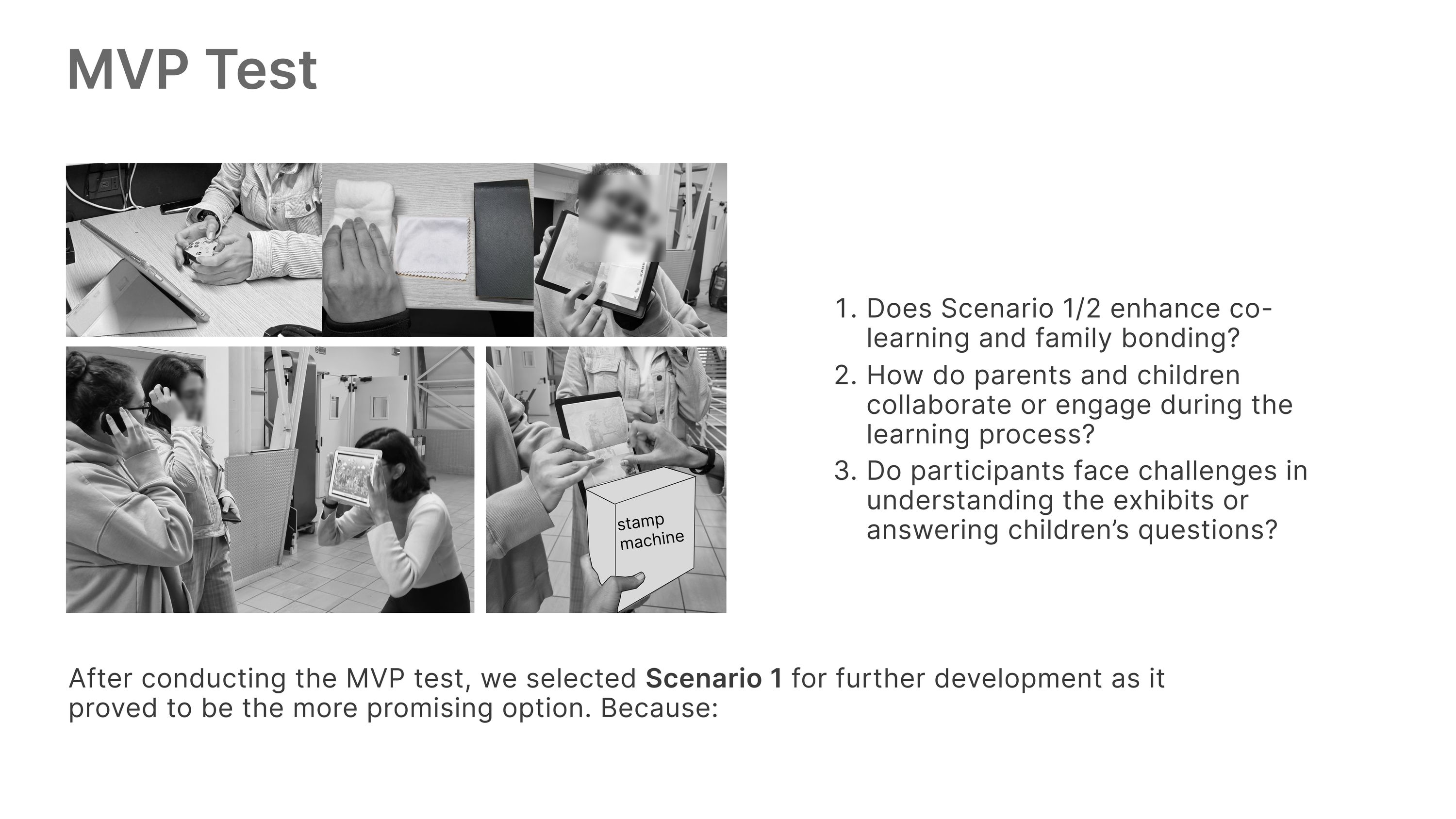
MVP test board with photographs of participants trying both scenarios and the three questions asked about co-learning, collaboration and comprehension
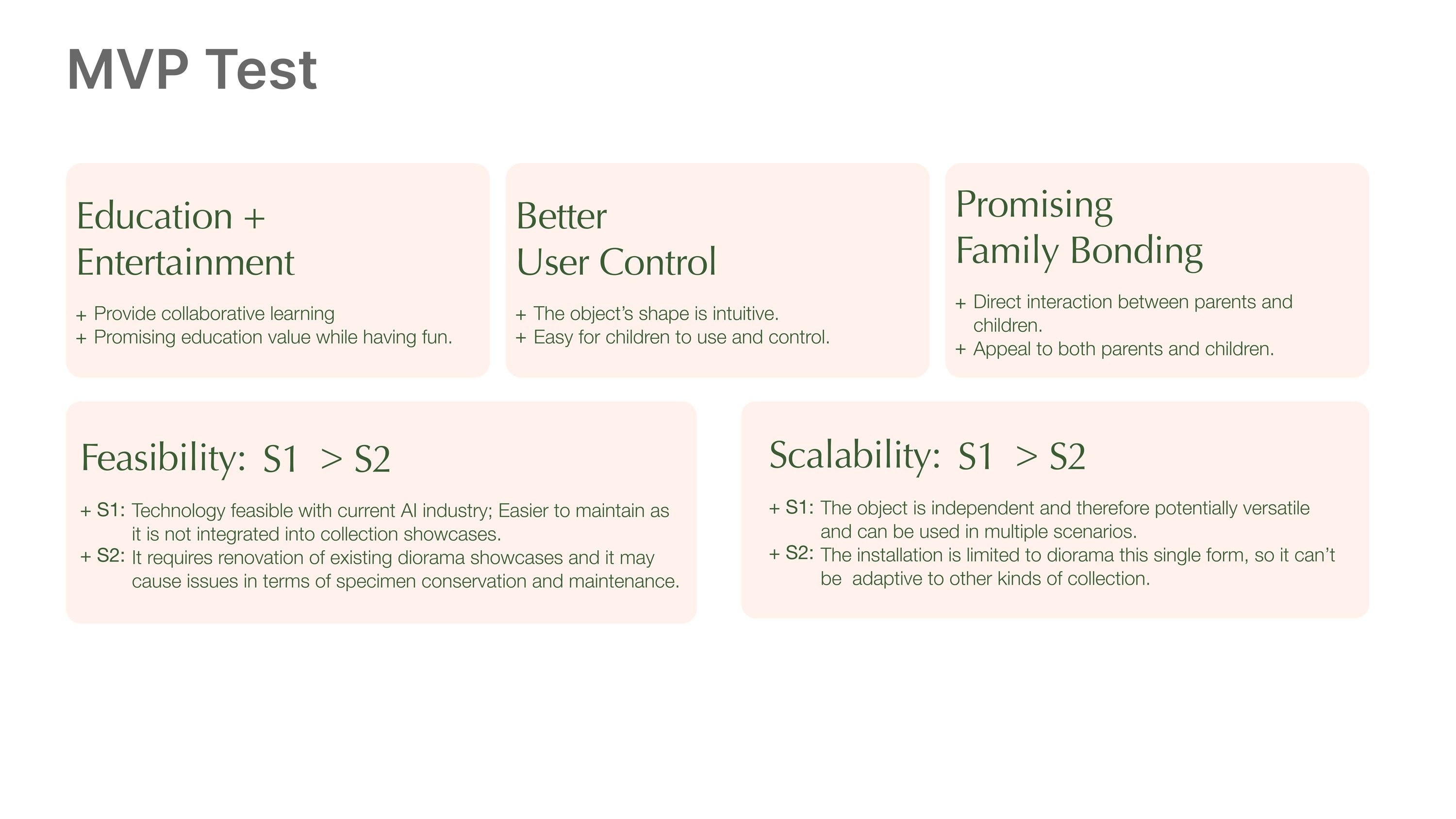
Both scenarios went in front of families before either was built, with three questions fixed in advance.
Comparison across education and entertainment, user control, family bonding, feasibility and scalability, with scenario one rated higher on feasibility and scalability
Scenario one won on feasibility and scalability. The diorama needed existing showcases renovated and could not adapt to other collections.

06 / System

Three touchpoints, decided by card sorting.

Closed card sorting aligned the architecture with how participants themselves grouped profile setup, storytelling and badge collection.
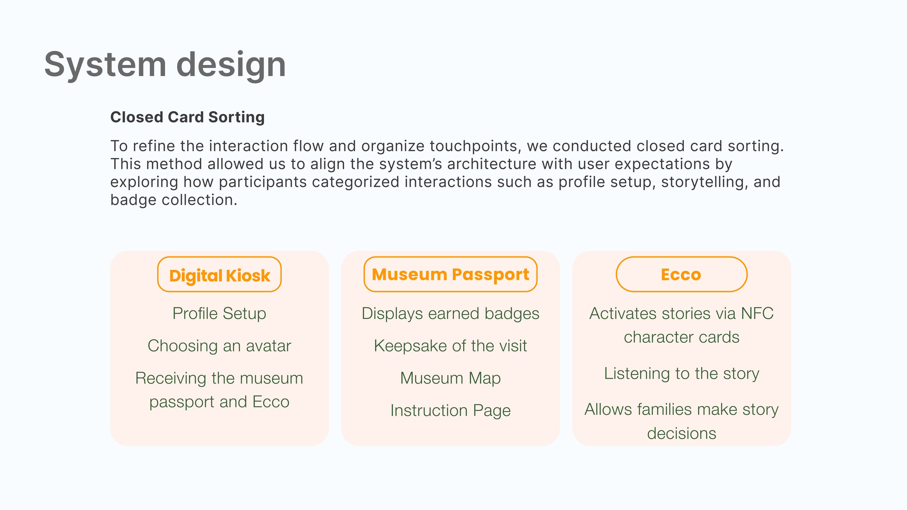
System design board explaining closed card sorting, resolving into a digital kiosk for setup, a museum passport for badges and the map, and Ecco which activates stories via NFC cards
The kiosk sets you up, the passport is what you keep, Ecco tells the story. Splitting them meant the handheld never had to hold a menu.
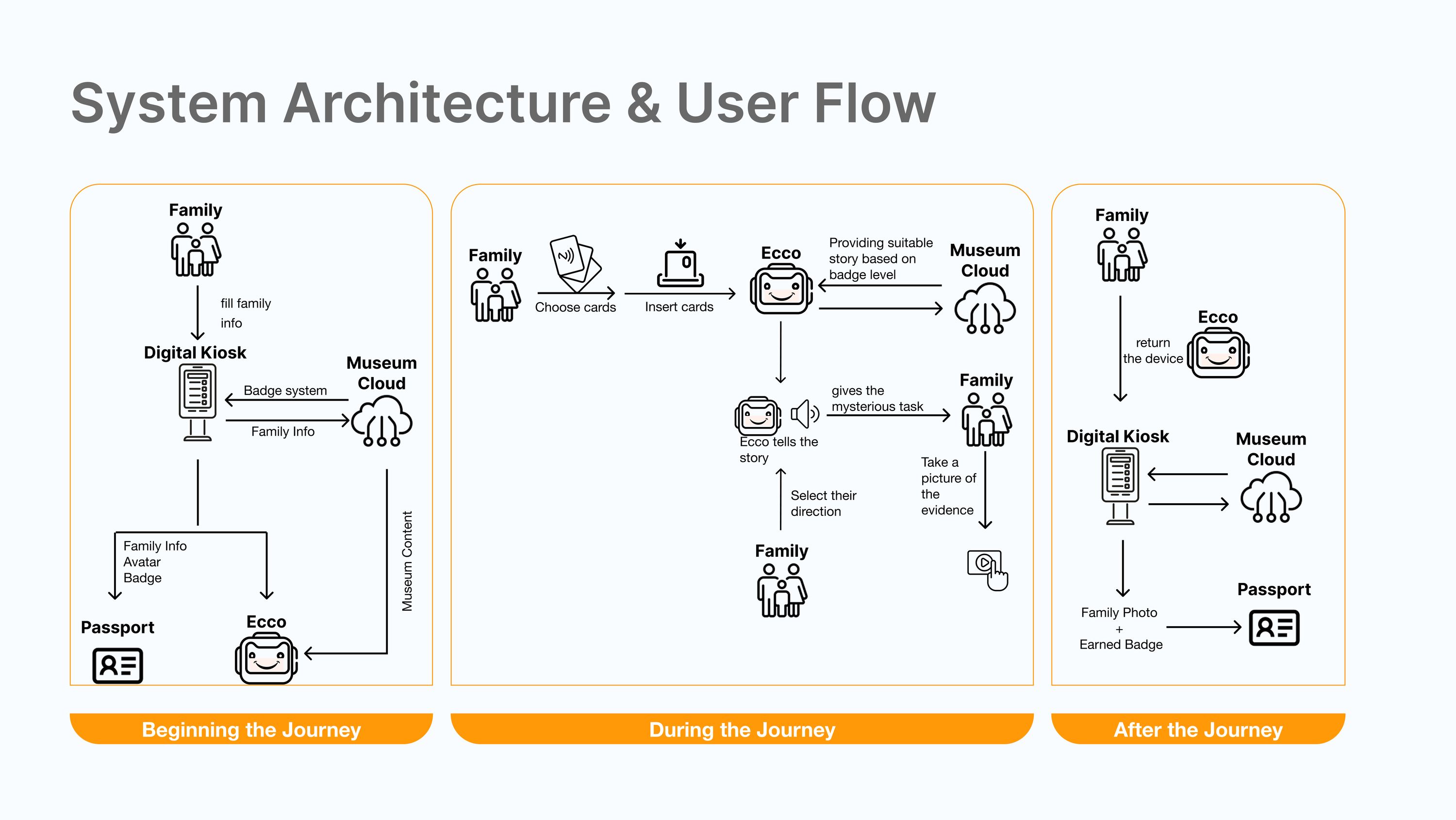
System architecture and user flow in three bands, beginning, during and after the journey, tracing family information through kiosk, badge system, museum cloud, Ecco and passport
The three touchpoints traced across the whole visit.
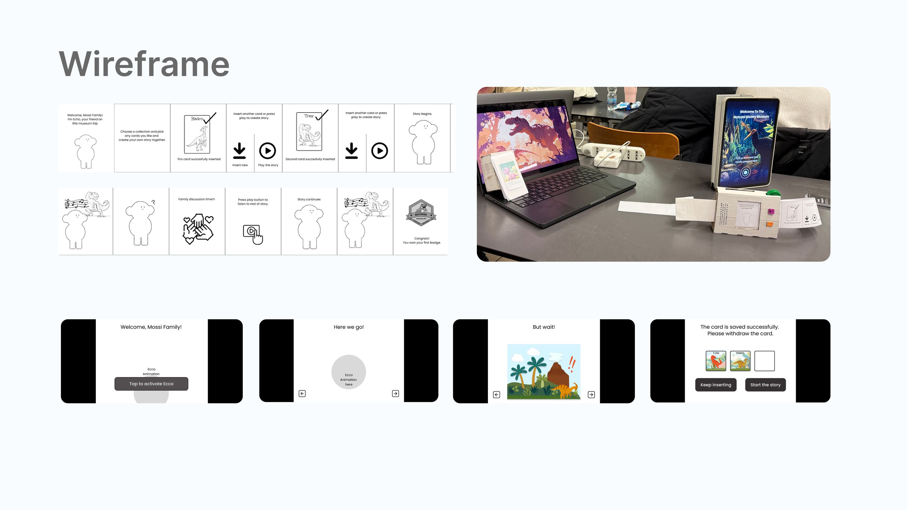
Wireframe set for the companion screens alongside a photograph of the working prototype rig
Wireframes, and the rig they were tested on.

07 / Development

Four stories, a design system, and a device you can hold.

The refined concept grew the story set and pushed the interaction outward into the diorama as well as the device, then it was built: form, internals, design system and the paper passport that goes home with you.
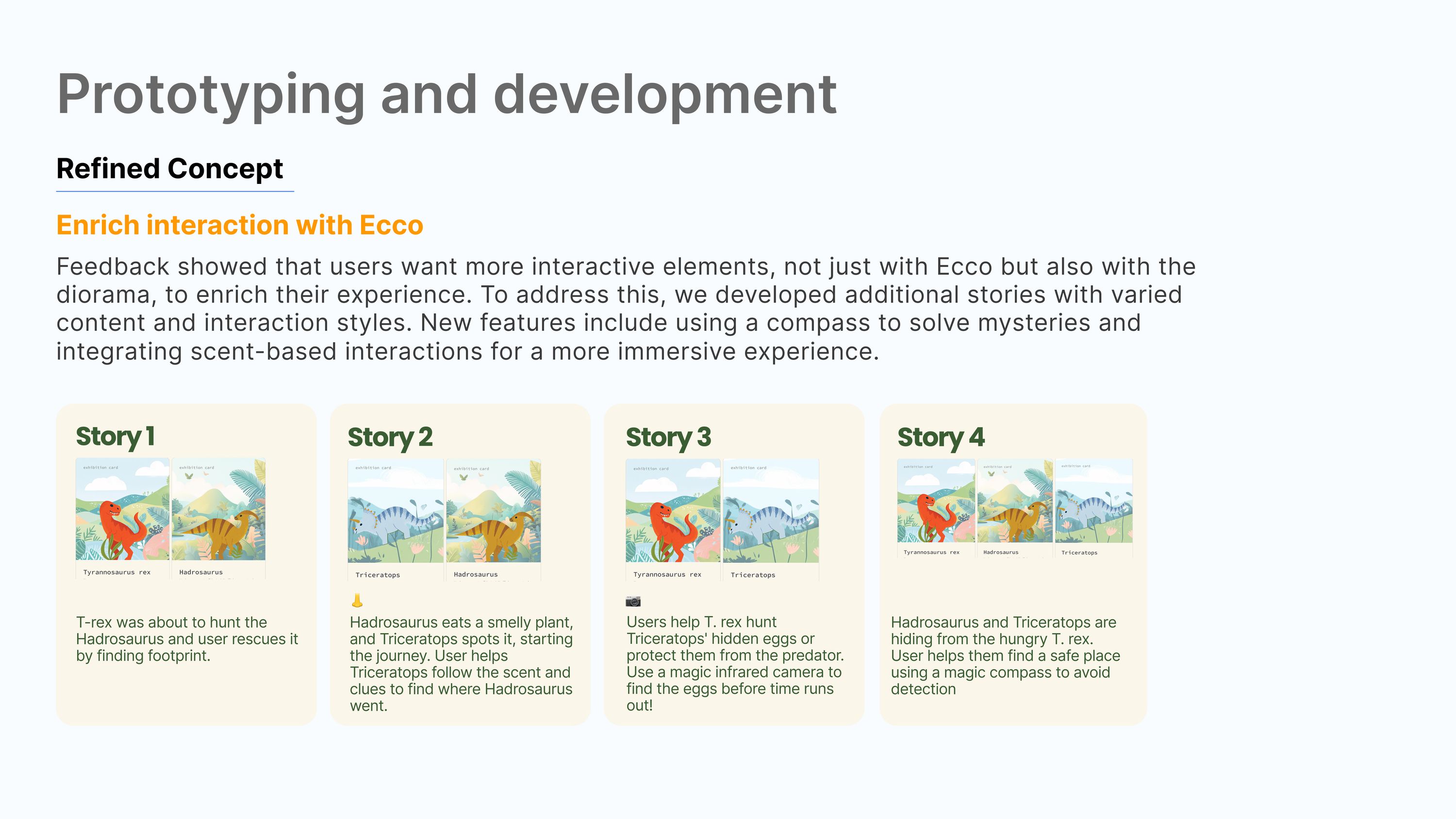
Refined concept with four illustrated dinosaur stories using different content and interaction styles including a compass and scent-based interaction
Four stories rather than one, each with a different interaction.
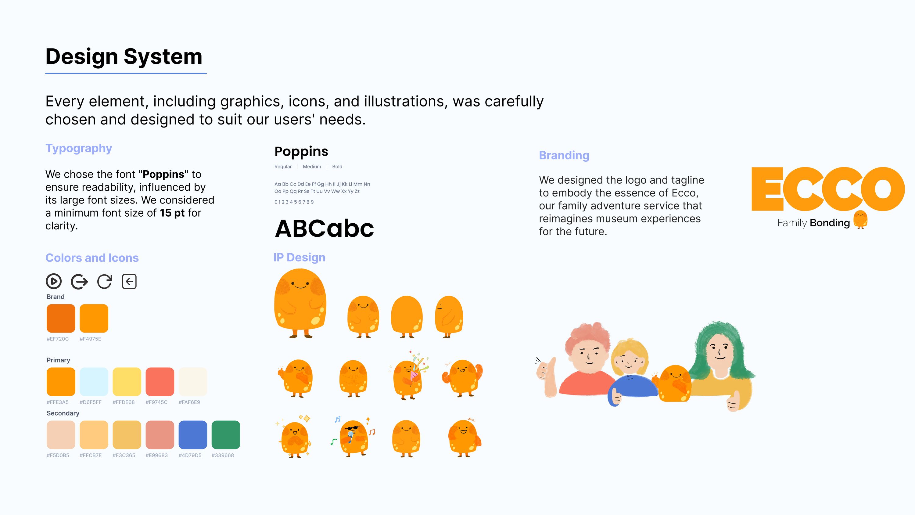
Design system board: Poppins at a 15pt minimum, brand and secondary colour palettes, icons, and the Ecco character in a range of poses
Poppins at a 15pt minimum, and a character drawn in enough poses to carry a story rather than sit as a logo.
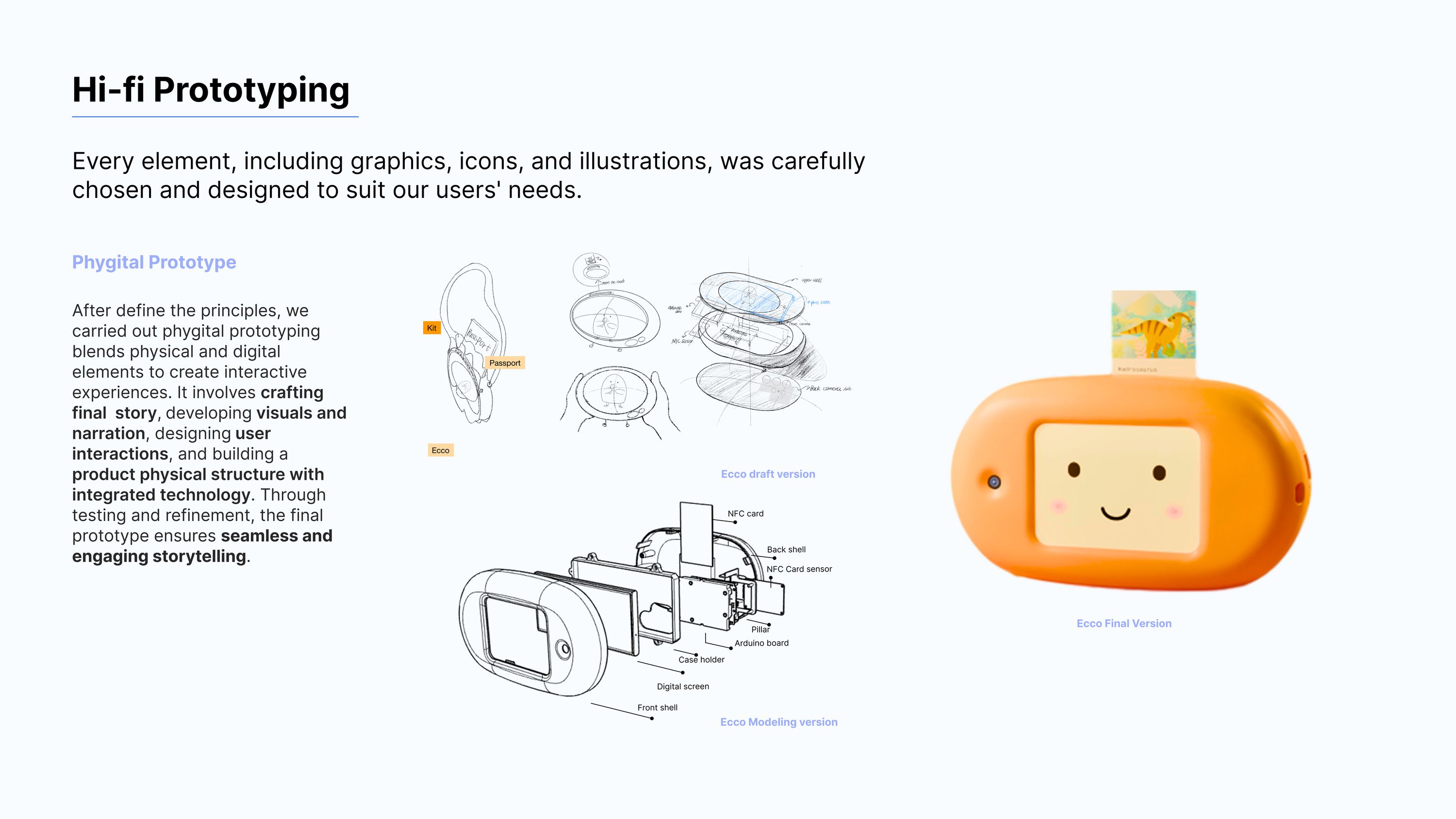
Phygital prototyping: hand sketches of the device form, CAD modelling of the internal structure with NFC slot and sensors, and the final moulded orange device
Sketch, CAD, internal structure with the NFC slot and sensors, and the moulded final body.
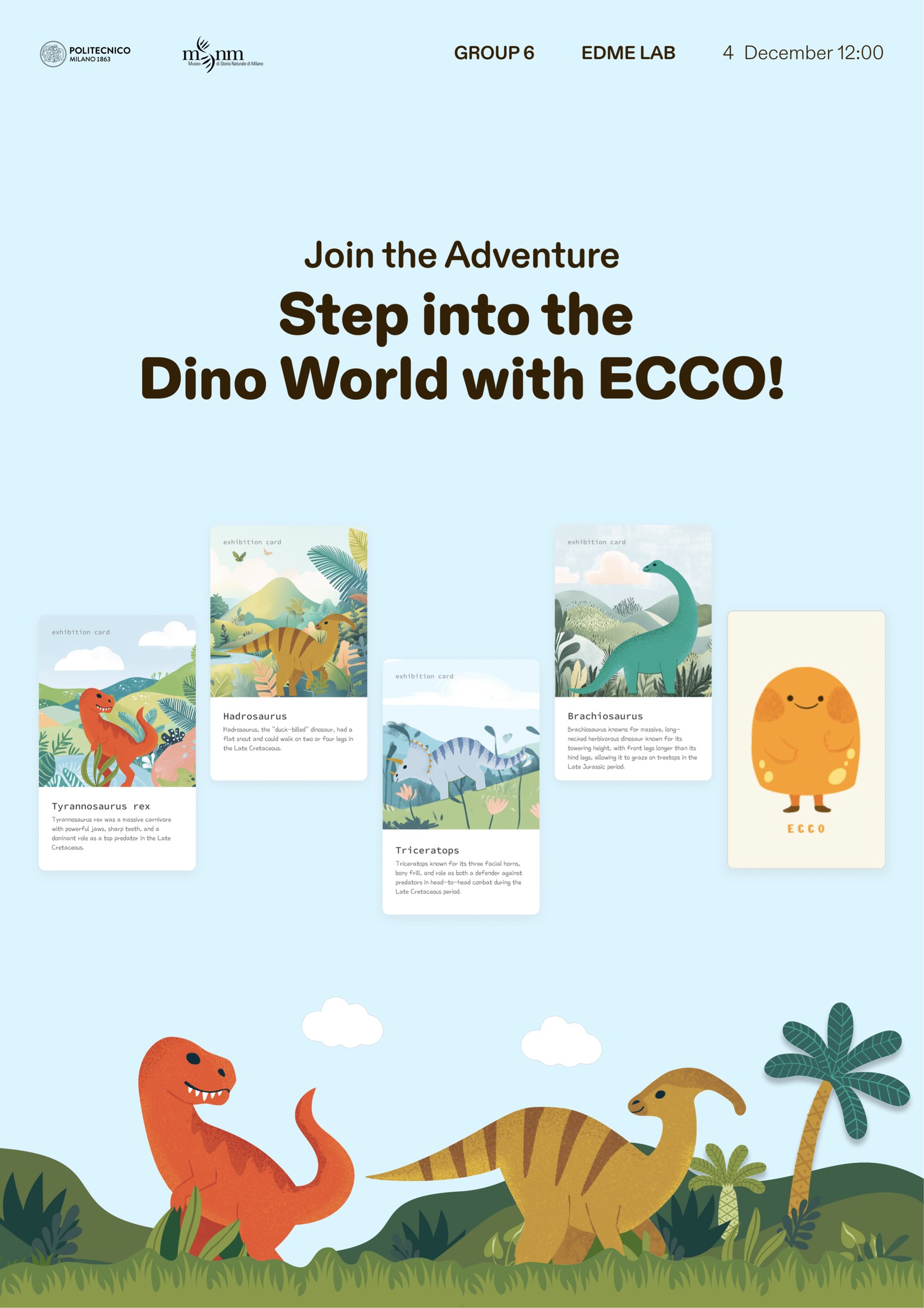
Exhibition poster showing the four NFC character cards, Tyrannosaurus rex, Hadrosaurus, Triceratops and Brachiosaurus, each with an illustrated scene and a short description, alongside the Ecco character
The NFC cards themselves. Each is a character and an exhibit at once: the card is what a child picks up, and what the device reads.
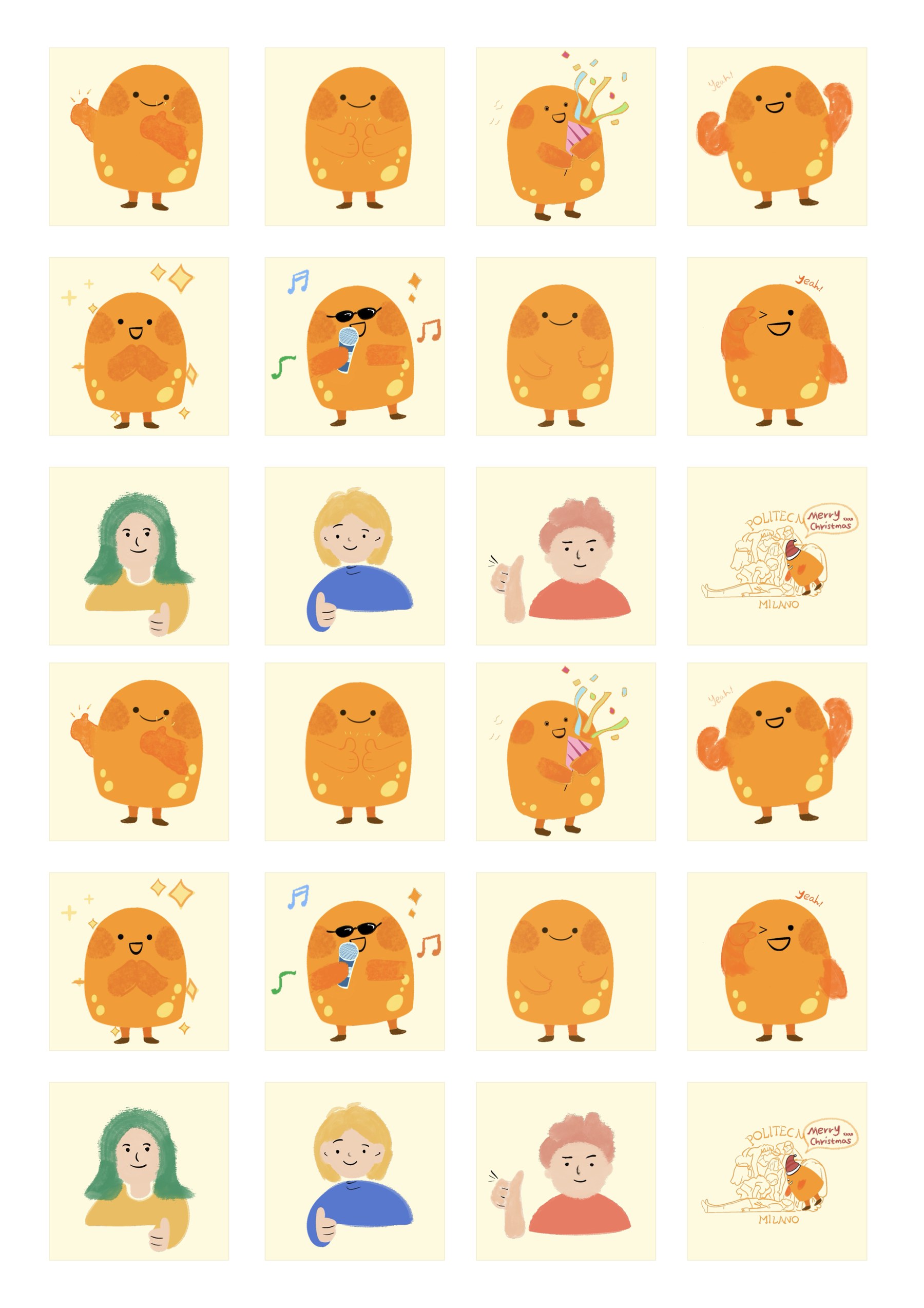
Sticker sheet of the Ecco character in a range of poses, waving, celebrating, singing and cheering, alongside the three family characters
The character drawn as a sticker set. Extending an IP into something printable is what let the badge and passport system feel like part of the same world.
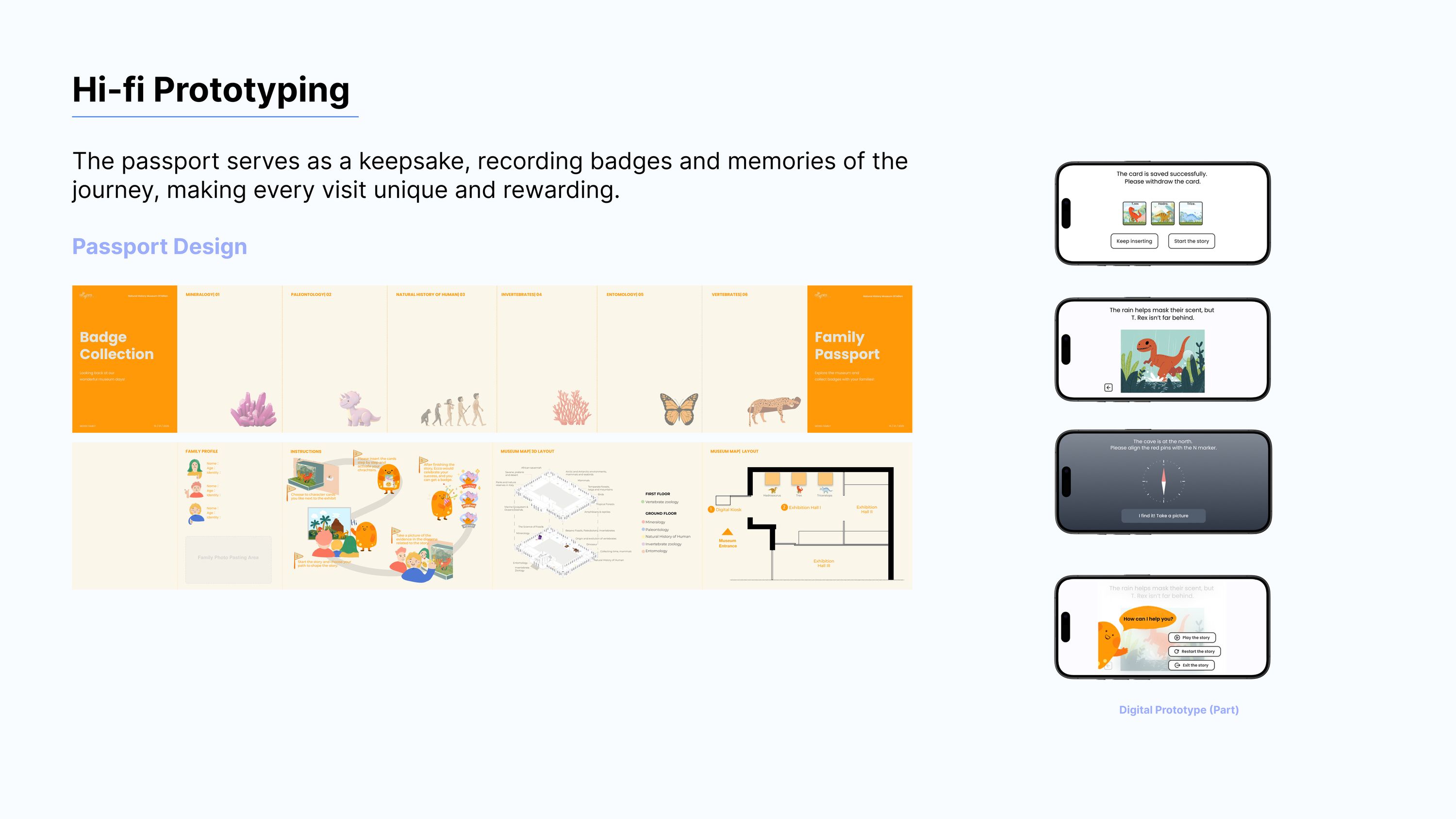
Passport design: badge collection sheet, family passport, museum map and accompanying digital prototype screens
The passport is the keepsake. Badges are collected on paper, so the visit leaves something behind that is not on a phone.
The printed family passport in full: a family profile page with name, age and identity for each member and a photo pasting area, an illustrated six-step instruction sequence, a 3D layout of the museum, and ground-floor and first-floor plans with each exhibit zone colour-coded
The passport as printed. It carries the real floor plans of Museo di Storia Naturale, with every zone colour-coded, so the keepsake doubles as the museum map.

08 / Testing

The bonding worked. The buttons did not.

The build was tested twice, at low and mid fidelity. Both rounds confirmed the premise and dismantled the interface, and it is the second that produced the changes above.
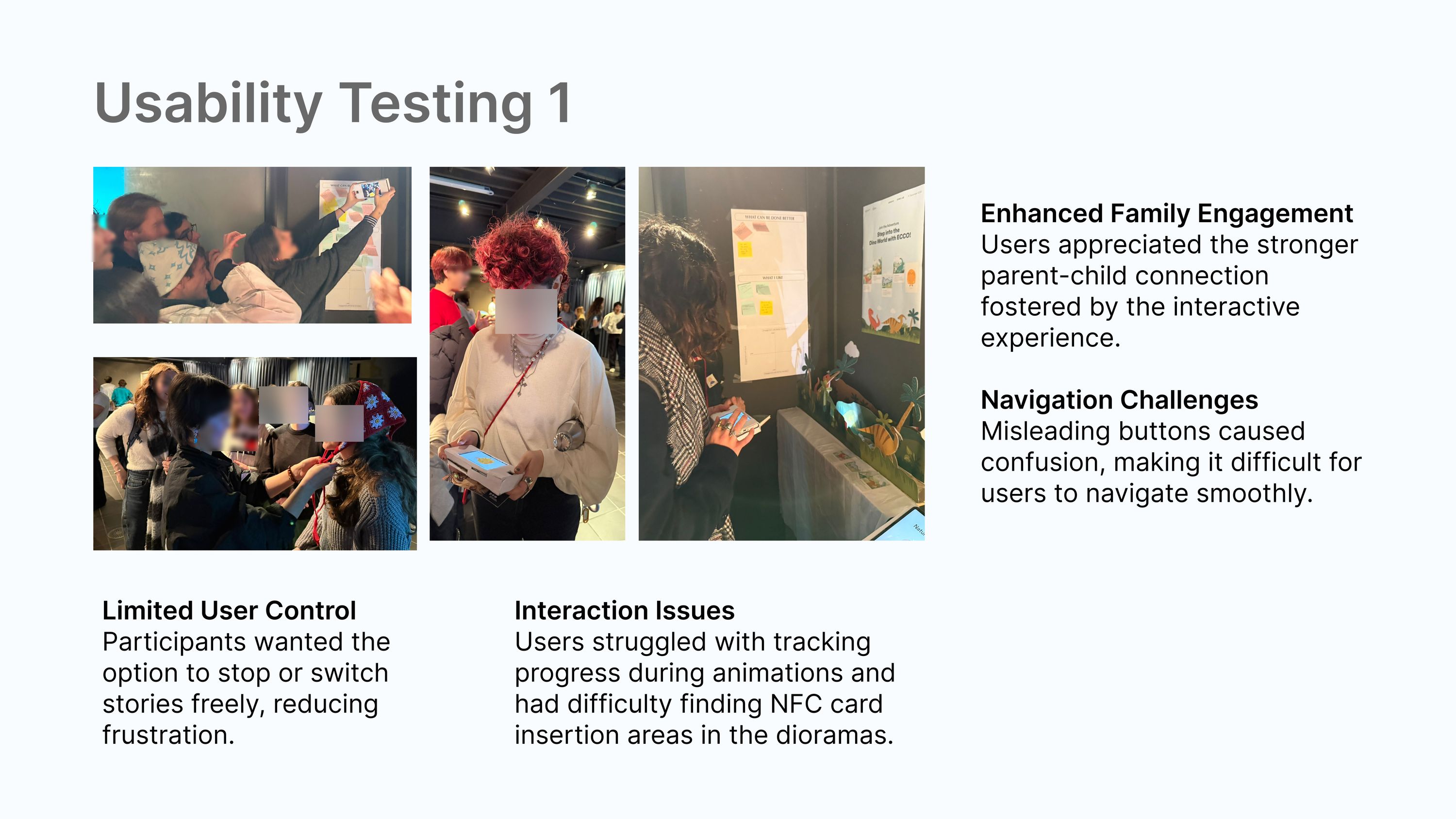
Usability testing one with photographs of families using the prototype, listing enhanced family engagement, navigation challenges, limited user control and interaction issues finding the NFC card slot
What held: the parent–child connection the concept rests on. What broke: misleading buttons, no way to stop or switch a story, and people could not find where to insert the NFC card. Participants’ faces are blurred.

Exhibition

From concept to something people could pick up.

The device was built and shown, and families used it in a constructed exhibit rather than a slide.
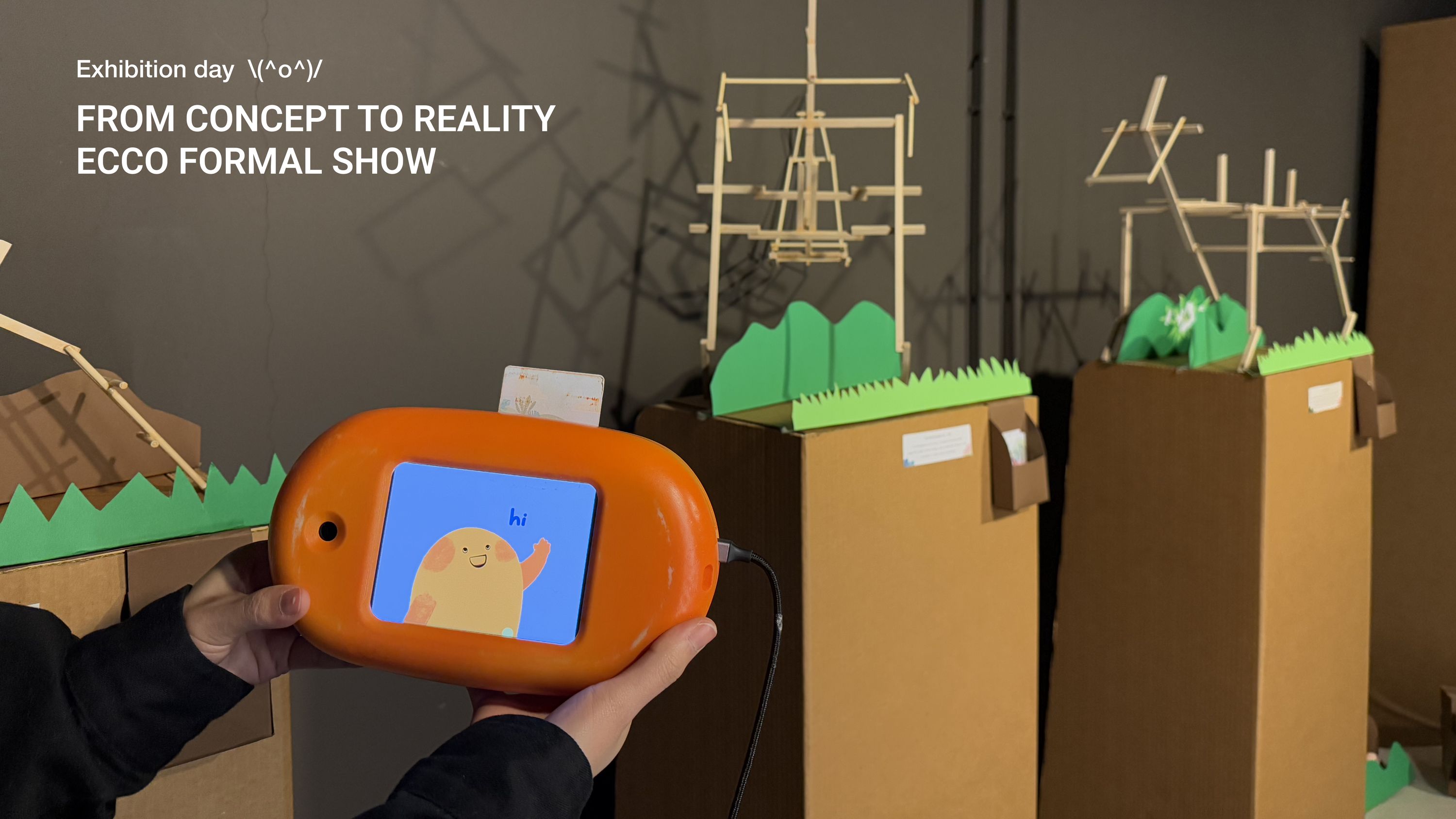
Exhibition day photograph, from concept to reality, the Ecco formal show, with the finished orange device held in front of a constructed cardboard and timber dinosaur exhibit
Exhibition day. The device, built, in front of a constructed exhibit.
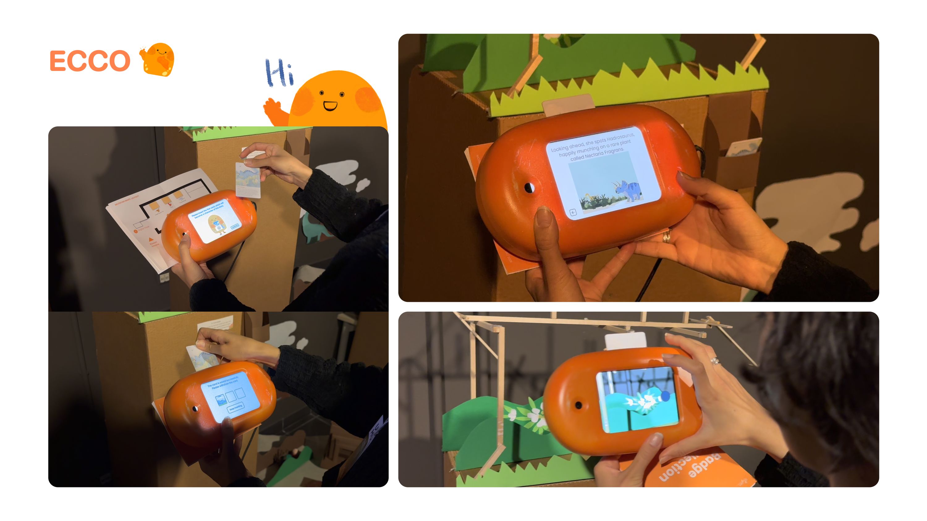
Photographs of Ecco in use: hands holding the device, inserting an NFC character card, and the screen showing the story
The card goes in, the story starts. The whole interaction is one physical gesture.
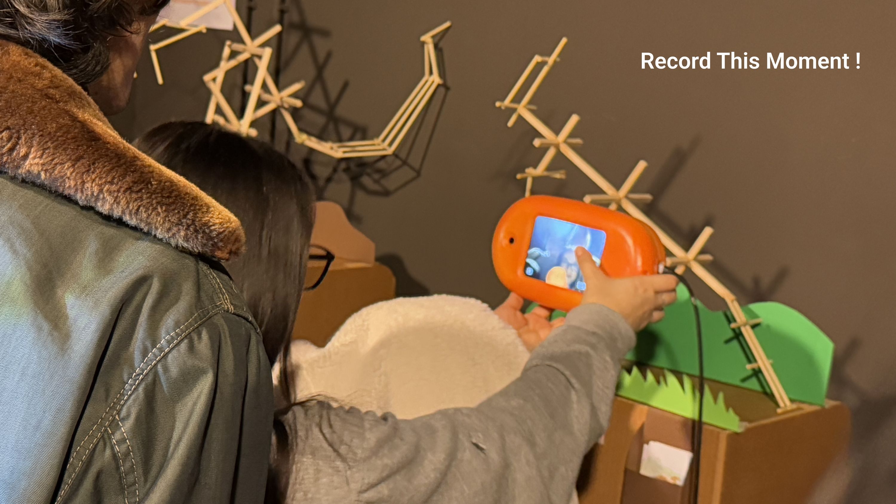
A visitor holding Ecco up to photograph the exhibit, captioned record this moment
Recording the moment, which becomes a badge in the passport.

Takeaways

What the project taught me.

Versatility and depth, at the same time.

A project on this scale needs design across many layers at once: research, story, interface, industrial form, electronics and exhibition. Doing that well means working in territory you do not know yet, and staying in it long enough to become useful.

Long projects need patience and iteration rather than one good idea. Two rounds of testing changed the interface substantially, and the second round is where the useful failures showed up.
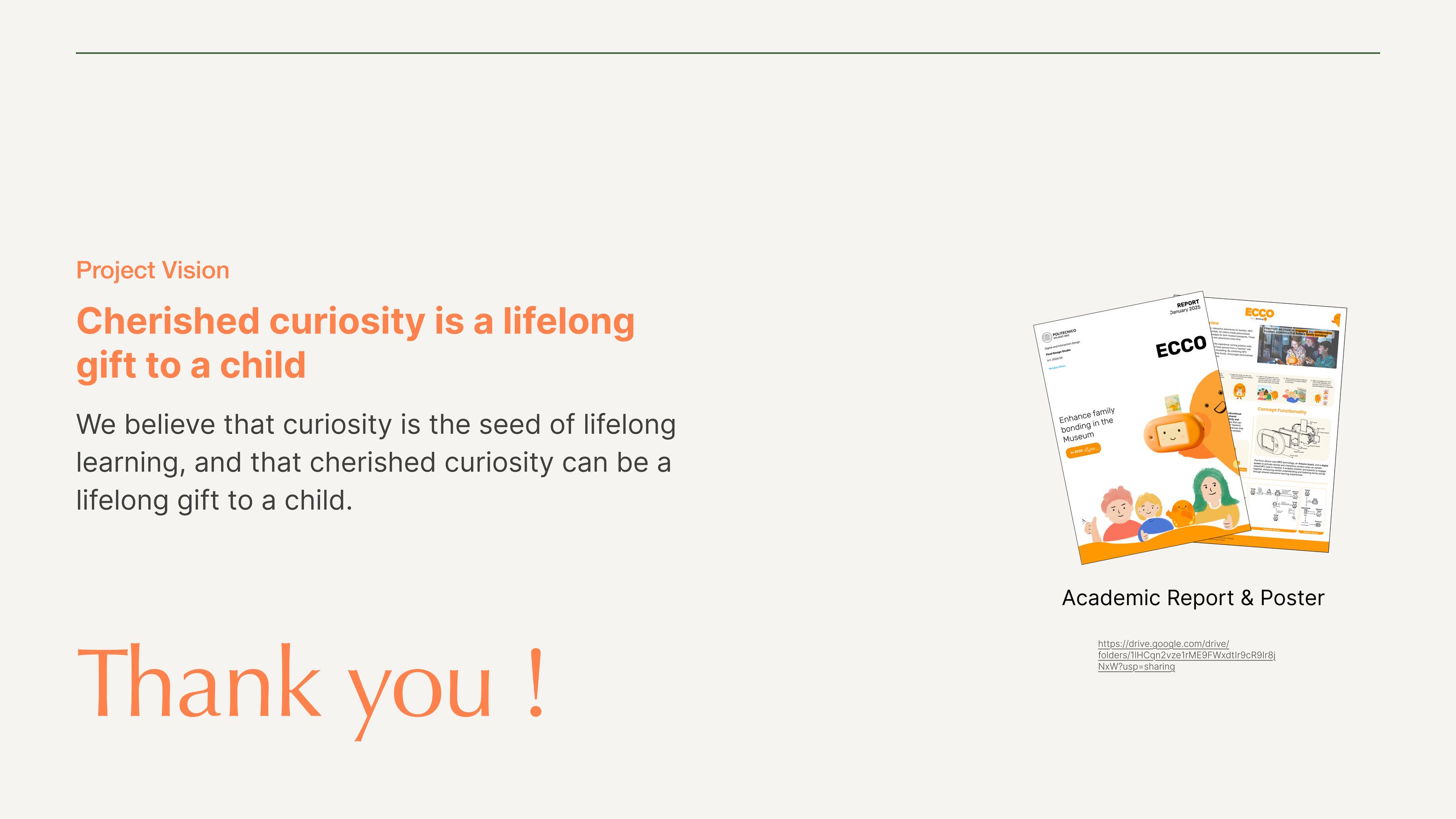
Project vision board reading cherished curiosity is a lifelong gift to a child, with the academic report and poster alongside
Cherished curiosity is a lifelong gift to a child. The project vision, and the academic report and poster it was submitted as.

Next project

Chiara →